
Nasdaq and S&P 500 Approaching Potential Resistance Zone and Further Market Breadth Improvements
The full post is available to view by members only. For immediate access:
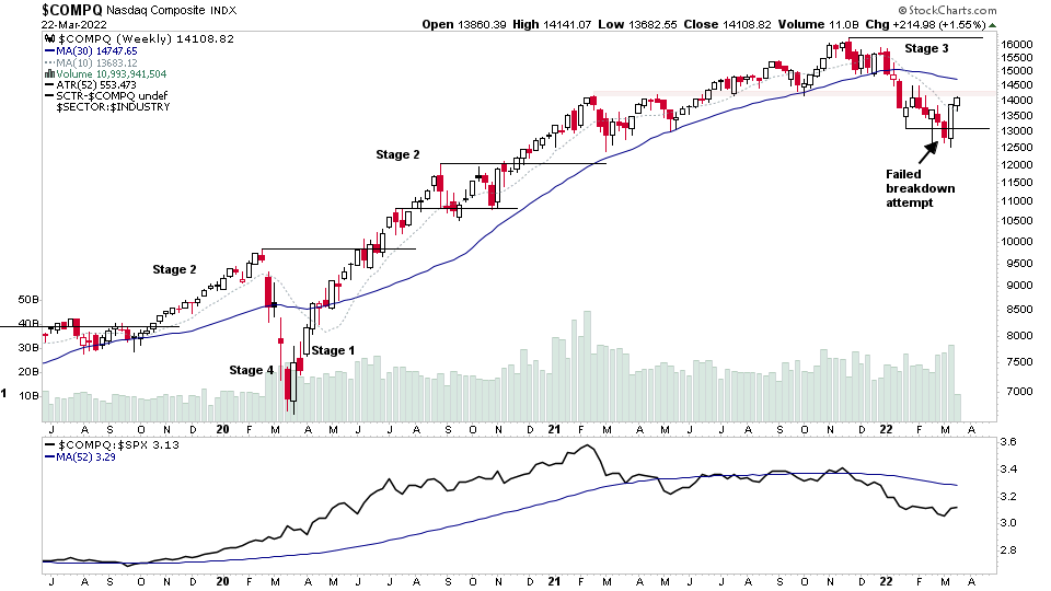
The Nasdaq Composite is approaching a significant level of interest that has acted as both support and resistance five times or so in the past year. Hence, it is a key level to overcome in order for the short term Change of Behaviour that we've seen to turn into a more significant Change of Character – which would be more bullish. As although the initial Stage 4 breakdown attempt failed and the rebound has been strong, relative strength in the Nasdaq remains weak versus the S&P 500 and it's moving into a logical area for shorts to initiate a test of the recent price action.
So while there are many short term positives developing in stocks and the market breadth, plus are a few longer term positives (see the Bullish Percent Index status changes further down the article). Caution still seems prudent, as after all, the Nasdaq remains in Stage 3. So it's far from a friendly trading environment.
However, if it can overcome the resistance, then that would be another postive towards the overall weight of evidence.
US Stocks Watchlist - 22 March 2022
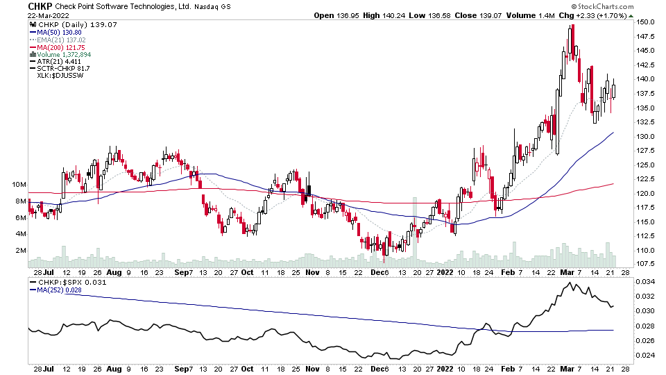
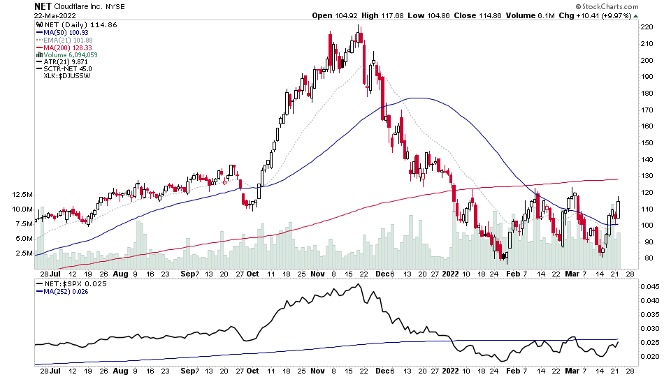
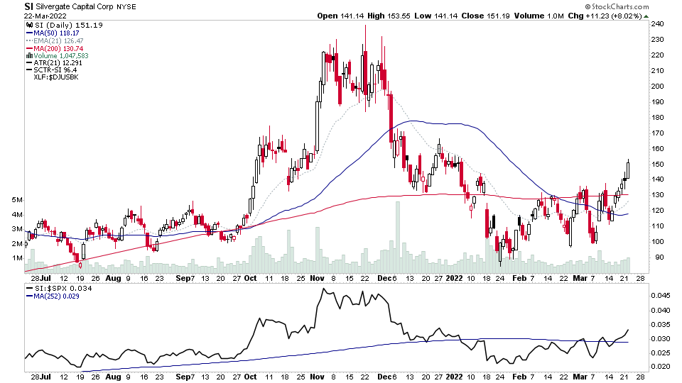
There were 33 stocks for the US stocks watchlist today. Here's a small sample from the list:
CHKP, MSFT, NET, SI + 29 more...

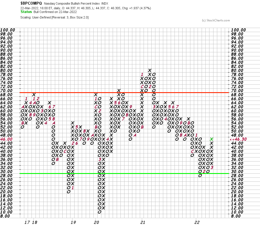
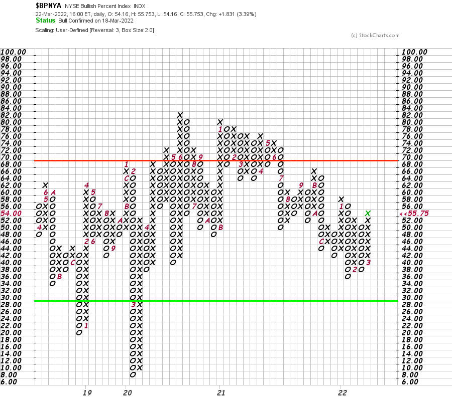
Market Breadth: Bullish Percent Index
The Nasdaq Bullish Percent Index made a double top breakout yesterday through the 44 level which I talked about in the Stage Analysis Members Weekend Video – which changes the P&F Status to Bull Confirmed after a visit to the lower zone, and the first status change to Bull Confirmed since the Bear Confirmed status began in February 2021.
The NYSE Bullish Percent Index made a double top breakout today through the 54 level – which changes the P&F Status to Bull Confirmed also.
Read the Bullish Percent article to learn more about the different P&F statuses.
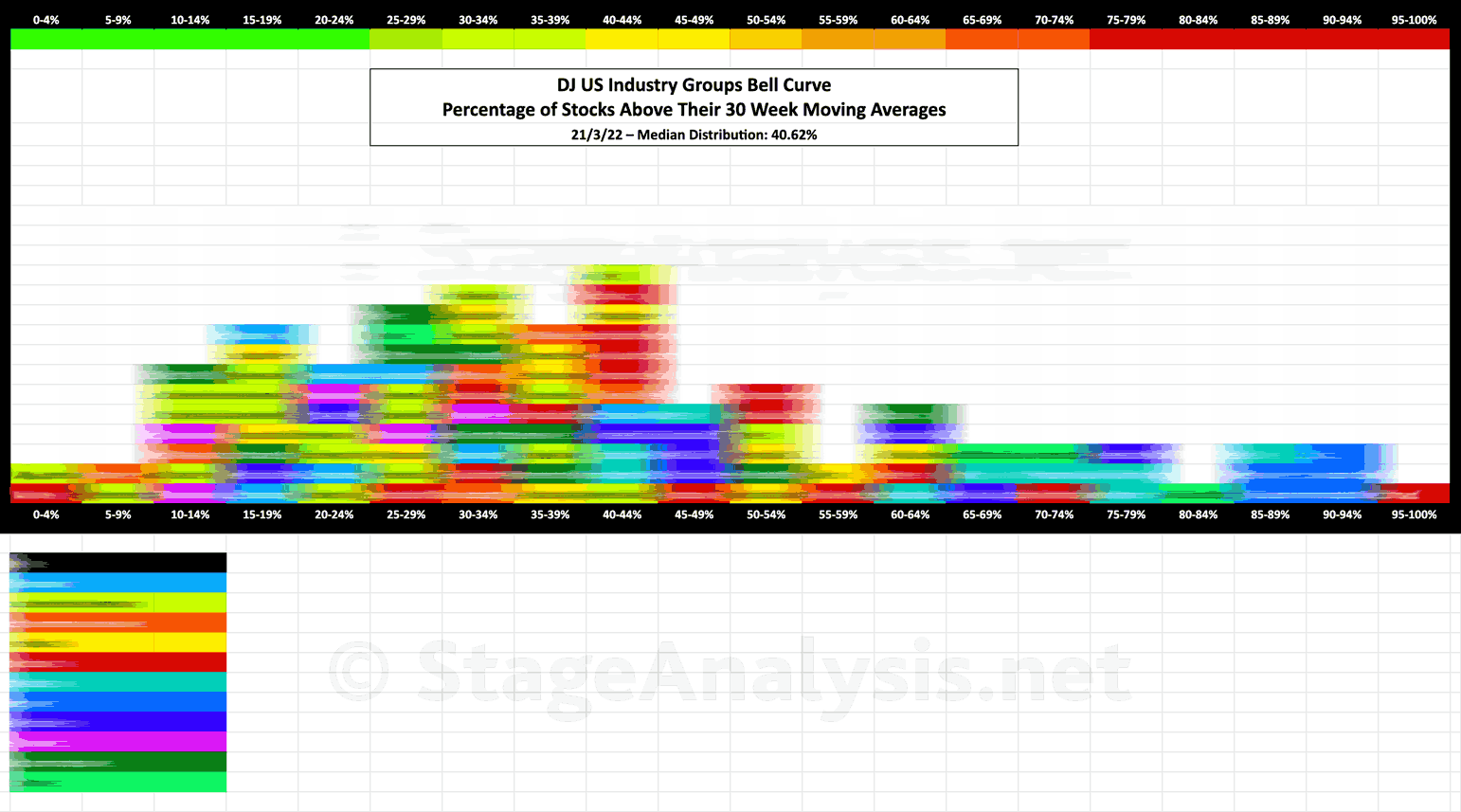
Industry Groups Bell Curve
Exclusive graphic of the 104 Dow Jones Industry Groups showing the Percentage of Stocks Above Their 30 Week Moving Average in each group visualised as a Bell Curve chart – inspired by the Sector Bell Curve work by Tom Dorsey in his Point & Figure book.
➜ Members can read the full article with the Group Bell Cure and data table at Industry Groups Bell Curve – Exclusive to Stage Analysis
Become a Stage Analysis Member:
To see more like this – US Stocks watchlist posts, detailed videos each weekend, use our unique Stage Analysis tools, such as the US Stocks & ETFs Screener, Charts, Market Breadth, Group Relative Strength and more...
Join Today
Disclaimer: For educational purpose only. Not investment advice. Seek professional advice from a financial advisor before making any investing decisions.