
Industry Groups Bell Curve – Exclusive to Stage Analysis
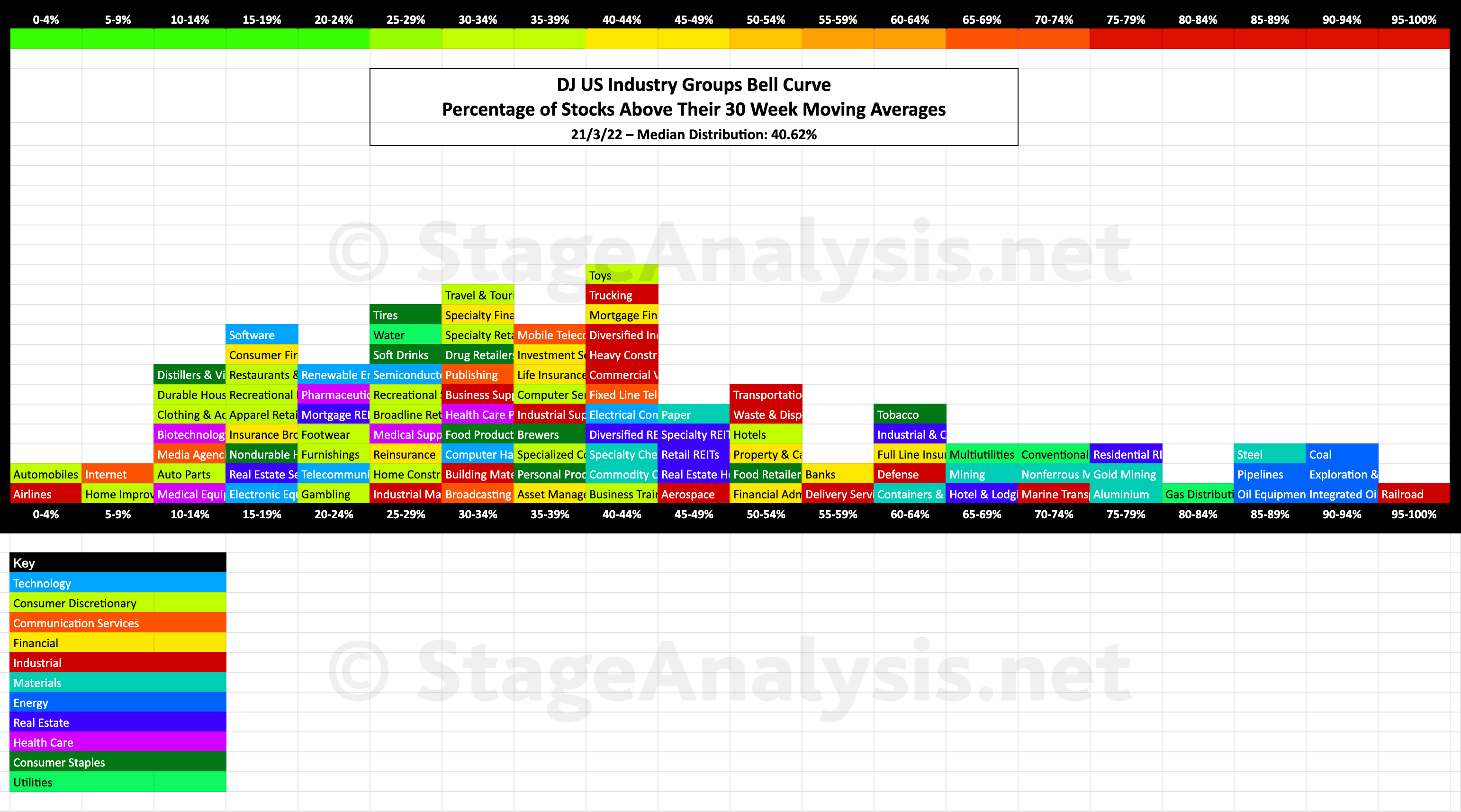
Exclusive graphic of the 104 Dow Jones Industry Groups showing the Percentage of Stocks Above Their 30 Week Moving Average in each group visualised as a Bell Curve chart – inspired by the Sector Bell Curve work by Tom Dorsey in his Point & Figure book...
The current median distribution is at 40.62%.
The graphic gives a unique perspective of the relative strength of each individual group by using the percentage of stocks above their 30 week MA in each group in a similar way that I do with the sector breadth chart that post each month – see the recent Market Breadth Update post to compare.
The scale is the same from 0% to 100%, but the chart is laid out horizontally instead of vertically to mimic the appearance of a bell curve – A bell curve is a graph depicting the normal distribution, which has a shape reminiscent of a bell.
I've also coloured coded it so that each sector can also be seen visually at a glance. So for example you can see that Consumer Discretionary groups (light green colour) are clustered in the lower end of the scale.
I'll aim to update this each month. But it is very time intensive to create, so will be time dependant.
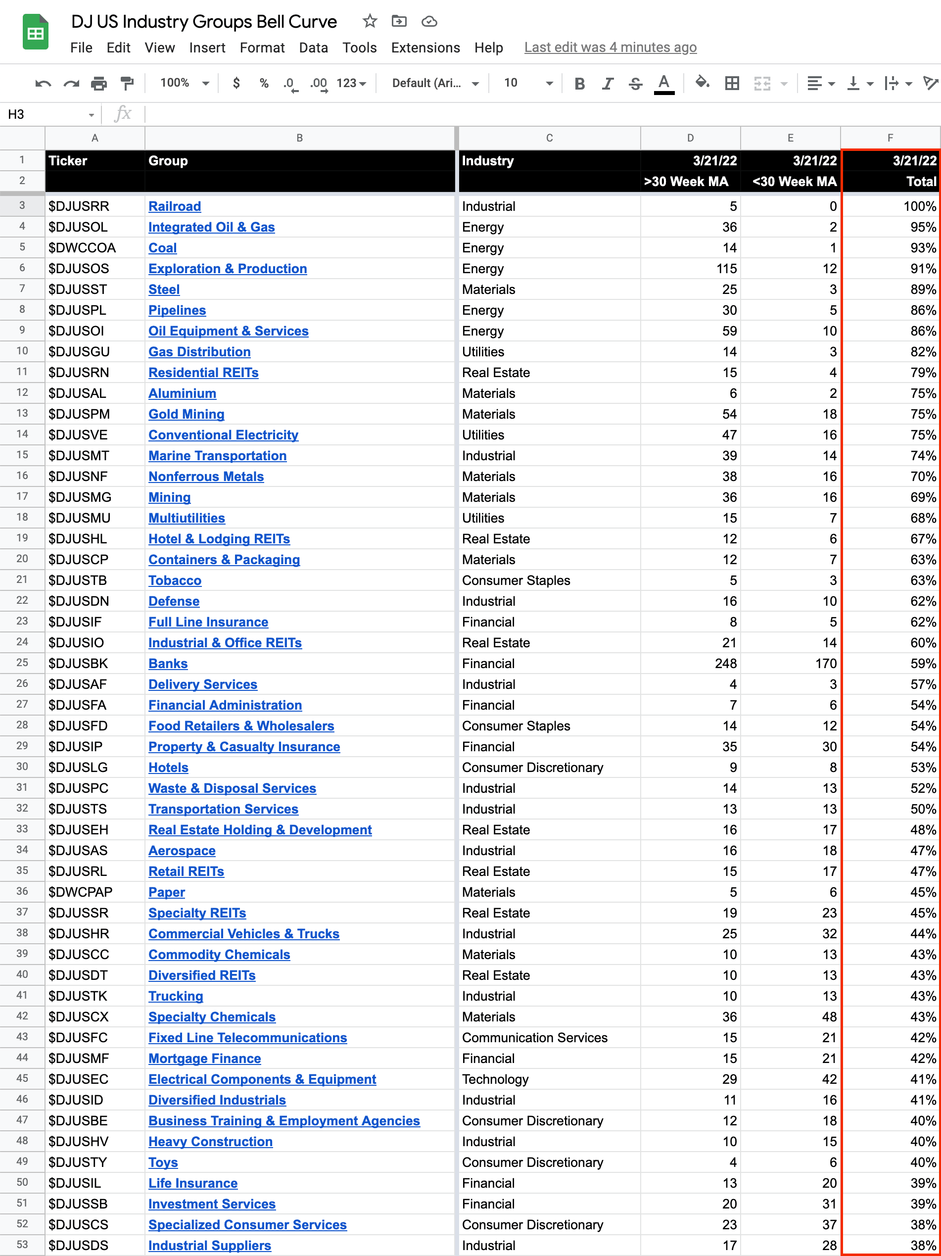
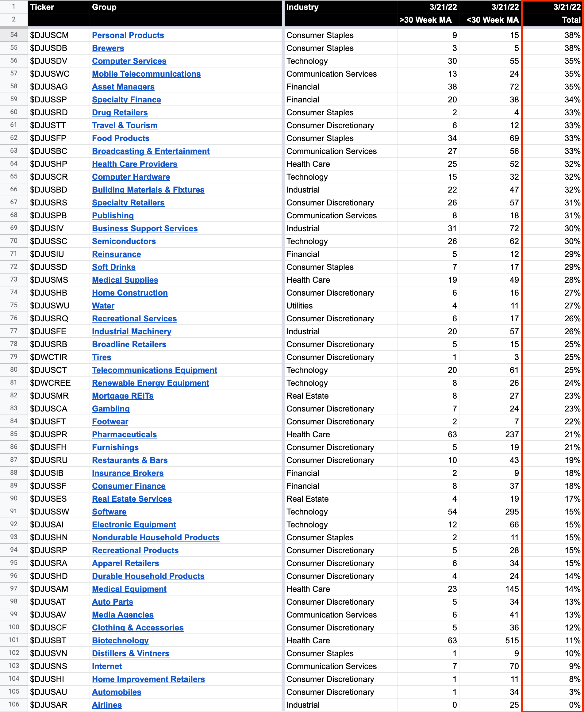
Below is the data tables with all 104 Industry Groups - ordered by Percentage of Stocks Above 30 week MA
Become a Stage Analysis Member:
To see more like this – US Stocks watchlist posts, detailed videos each weekend, use our unique Stage Analysis tools, such as the US Stocks & ETFs Screener, Charts, Market Breadth, Group Relative Strength and more...
Join Today
Disclaimer: For educational purpose only. Not investment advice. Seek professional advice from a financial advisor before making any investing decisions.