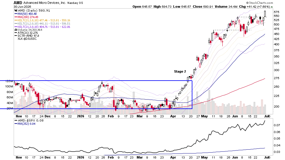
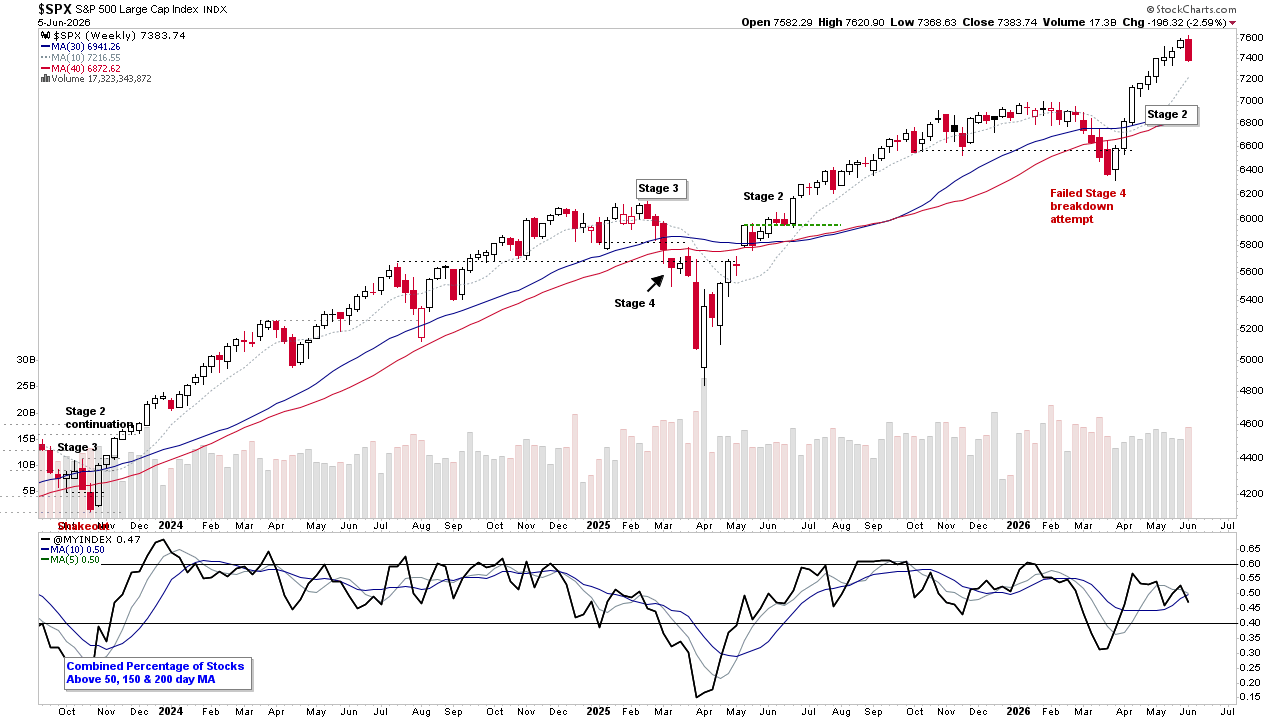
The Stage Analysis members video this week begins with a discussion of the current US Watchlist Stocks on multiple timeframes, Stage 2 Breakout & Stage 4 Breakdown attempts, Stages Summary, the Sector breadth and Sub-industries Bell Curves, Relative Strength Rankings, the key Market Breadth Charts to determine the Weight of Evidence, Bitcoin & Ethereum, the Major US Stock Market Indexes and the ETF Summary.
Read More

Blog
One of the most effective long term market breadth tools for assessing risk and identifying differences in supply and demand in the market is the NYSE Bullish Percent Index.
The NYSE Bullish Percent Index was developed by the founder of Investors Intelligence, Abe Cohen, in 1955. Who was trying try create a contrary market indicator that was bullish at the bottom and bearish at the top. And so set out to create an indicator that would act as a barometer of the market risk in order to help him to become more defensive at stock market tops and more offensive near to stock market bottoms.
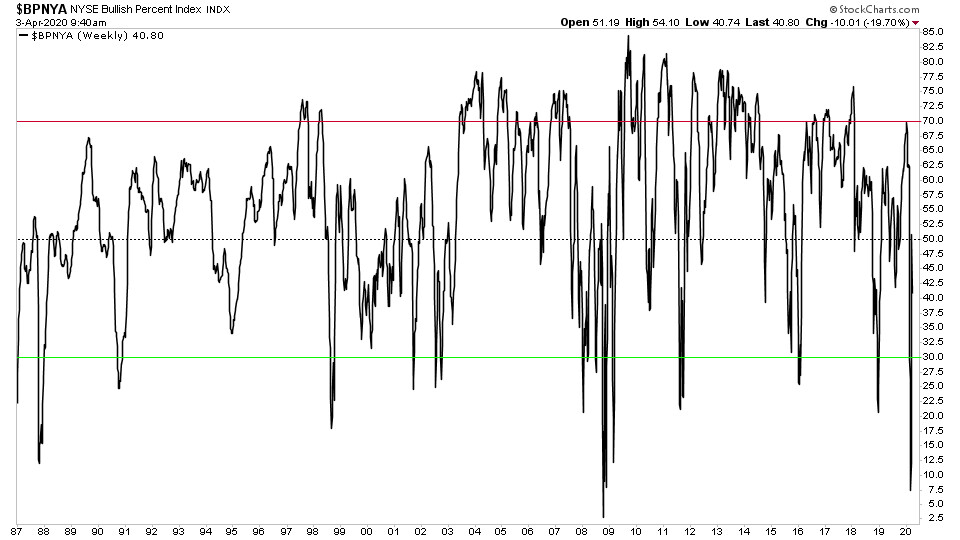
NYSE Bullish Percent Index Chart - Long Term 30+ Years Line Chart
It is simple to create the NYSE Bullish Percent Index, as it is simply the percentage of stocks in the NYSE that are on a point and figure buy signal, and is charted with a range of 0% to 100%.
So for example if there were a total of 2500 stocks in the NYSE, and 1750 of them were on point and figure buy signals, then the NYSE Bullish Percent would be at 70%.
It can be charted as either a line chart or via a point and figure chart. However, the signals that Cohen developed are generated using the point and figure chart. But I do personally find it useful to look at the line chart also.
The point and figure chart has a box size of 2% for each X or O plotted on the chart, and uses the 3 box reversal method. Therefore, if the right hand column was moving higher in a column of Xs, then in order to add another X to the column, it would need a total net move of 2% or more. Whereas, in order to get a reversal to a column of Os, it would need a total net move of -6%.
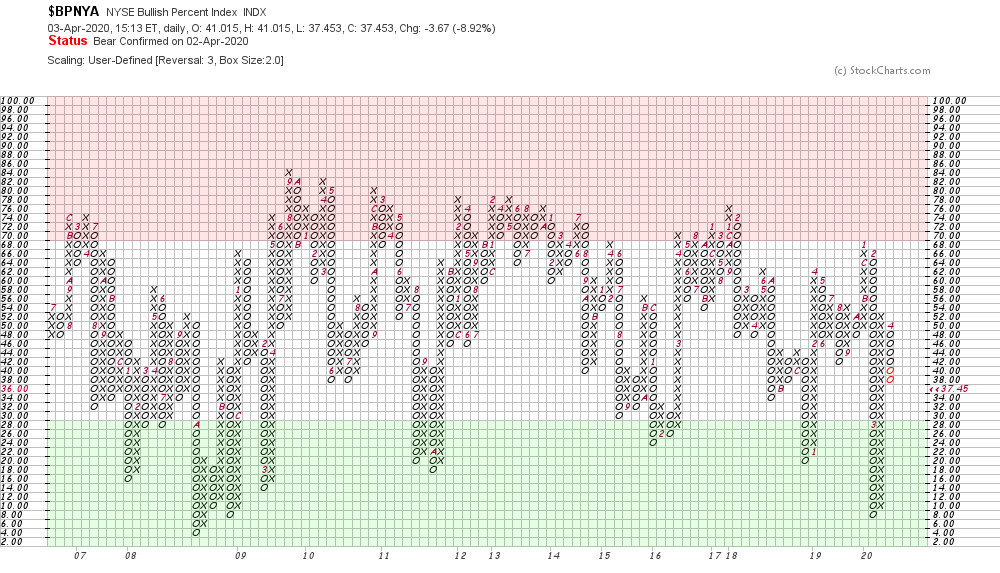
NYSE Bullish Percent Index - Point and Figure Chart
A common analogy used with Bullish Percent charts is that of an American football game, with the 0% to 100% range representing the entire field, with two end zones. The high risk end zone above the 70% level, and the low risk end zone below the 30% level. With the current level of the Bullish Percent representing the field position.
We’ll call the two teams playing the “Bulls“ (Xs) and the “Bears” (Os), and it’s then our job to use the appropriate strategies depending on which team has the ball, and what their field position is. So for example, when the Bullish Percent is on a P&F buy signal, rising in a column of Xs out of the lower risk zone at the bottom of the field. Then the Bulls team have possession of the ball with room to run higher, and so it would be time to play offense. Whereas if the Bullish Percent level is above 70% in the high risk end zone, but then reverses to a column of Os. Then the Bears team have gotten hold of the ball, and hence the Bulls team would need to shift their strategy to defense to protect from the bears scoring against them.
Bullish Percent Signals
There are seven market conditions which were defined in Earl Blumenthal’s book “Chart for Profit” in 1975 and then further refined by Investors Intelligence editor Mike Burke in 1982.
Bull Alert
The chart column of X’s (rising) and moving up from below 30%, but has not yet generated a point and figure buy signal.
Bull Alert
Bull Confirmed
The chart is on a point and figure buy signal and is in a column of X’s (rising); and/or is above 68% in a column of X’s .
Bull Confirmed
Bull Correction
The chart is on a point and figure buy signal, but is column of O’s (falling) without yet reaching 70%.

Bull Correction
Bull Top
The chart is in a column of O's (falling) but is still above 70%.

Bull Top
Bear Alert
The chart is falling from above 70% (column of O’s) to below 70%, without generating a point and figure sell as yet.

Bear Alert
Bear Confirmed
The chart is falling (column of O’s) and has generated a point and figure sell signal and is also below 70% .

Bear Confirmed
Bear Correction
The chart is on a point and figure sell signal, but is in a column of X’s (rising) without having moved above 68%.

Bear Correction
Become a Stage Analysis Member:
To see more like this – US Stocks watchlist posts, detailed videos each weekend, use our unique Stage Analysis tools, such as the US Stocks & ETFs Screener, Charts, Market Breadth, Group Relative Strength and more...
Join Today

05 July, 2026
Stage Analysis Members Video – 5 July 2026 (1hr 5mins)
01 July, 2026
US Stocks Watchlist – 1 July 2026
There were 20 stocks highlighted from the US stocks watchlist scans today...
Read More

21 June, 2026
Stage Analysis Members Video – 21 June 2026 (53mins)
The Stage Analysis members video beginning with a discussion of the current US Watchlist Stocks on multiple timeframes, Stage 2 Breakout & Stage 4 Breakdown attempts, Stages Summary, the Sector breadth and Sub-industries Bell Curves, Relative Strength Rankings, the key Market Breadth Charts to determine the Weight of Evidence, Bitcoin & Ethereum, the Major US Stock Market Indexes and the ETF Summary.
Read More

14 June, 2026
Stage Analysis Members Video – 14 June 2026 (53mins)
The Stage Analysis members video discussing the current US Watchlist Stocks on multiple timeframes, Stage 2 Breakout & Stage 4 Breakdown attempts, Stages Summary, the Sector breadth and Sub-industries Bell Curves, Relative Strength Rankings, the key Market Breadth Charts to determine the Weight of Evidence, Bitcoin & Ethereum, the Major US Stock Market Indexes and the ETF Summary.
Read More
07 June, 2026
Stage Analysis Members Video – 7 June 2026 (1hr 1mins)
The Stage Analysis members video beginning with a discussion of the the Major US Stock Market Indexes, the ETF Summary, current US Watchlist Stocks on multiple timeframes, Stage 2 Breakout & Stage 4 Breakdown attempts, Stages Summary, the Sector breadth and Sub-industries Bell Curves, Relative Strength Rankings, the key Market Breadth Charts to determine the Weight of Evidence and Bitcoin & Ethereum.
Read More

31 May, 2026
Stage Analysis Members Video – 31 May 2026 (53mins)
The Stage Analysis members video beginning with a discussion of the current US Watchlist Stocks on multiple timeframes, Stage 2 Breakout & Stage 4 Breakdown attempts, Stages Summary, the Sector breadth and Sub-industries Bell Curves, Relative Strength Rankings, the key Market Breadth Charts to determine the Weight of Evidence, Bitcoin & Ethereum, the Major US Stock Market Indexes and ETF Summary.
Read More

24 May, 2026
Stage Analysis Members Video – 24 May 2026 (51 mins)
The Stage Analysis members video discussing the current US Watchlist Stocks on multiple timeframes, Stage 2 Breakout & Stage 4 Breakdown attempts, Stages Summary, the Sector breadth and Sub-industries Bell Curves, Relative Strength Rankings, the key Market Breadth Charts to determine the Weight of Evidence, Bitcoin & Ethereum, the Major US Stock Market Indexes and ETF Summary.
Read More

17 May, 2026
Stage Analysis Members Video – 17 May 2026 (1hr 10mins)
The Stage Analysis members video beginning with a discussion of the current US Watchlist Stocks on multiple timeframes, Stage 2 Breakout & Stage 4 Breakdown attempts, Stages Summary, the Sector breadth and Sub-industries Bell Curves, Relative Strength Rankings, the key Market Breadth Charts to determine the Weight of Evidence, Bitcoin & Ethereum, the Major US Stock Market Indexes and ETF Summary.
Read More

10 May, 2026
Stage Analysis Members Video – 10 May 2026 (1hr)
The Stage Analysis members video discussing the current US Watchlist Stocks on multiple timeframes, Stage 2 Breakout & Stage 4 Breakdown attempts, Stages Summary, the Sector breadth and Sub-industries Bell Curves, Relative Strength Rankings, the key Market Breadth Charts to determine the Weight of Evidence, Bitcoin & Ethereum, the Major US Stock Market Indexes and ETF Summary.
Read More

03 May, 2026
Stage Analysis Members Video – 3 May 2026 (1hr 17mins)
The Stage Analysis members video beginning with a discussion of the current US Watchlist Stocks on multiple timeframes, Stage 2 Breakout & Stage 4 Breakdown attempts, Stages Summary, the Sector breadth and Sub-industries Bell Curves, Relative Strength Rankings, the key Market Breadth Charts to determine the Weight of Evidence, Bitcoin & Ethereum, the Major US Stock Market Indexes and ETF Summary.
Read More