
US MARKET BREADTH: Some People Say the Stock Market Has Bottomed – But Has It?
- Timing the US Stock Market Using the Market Breadth Indicators – Introduction (0:00)
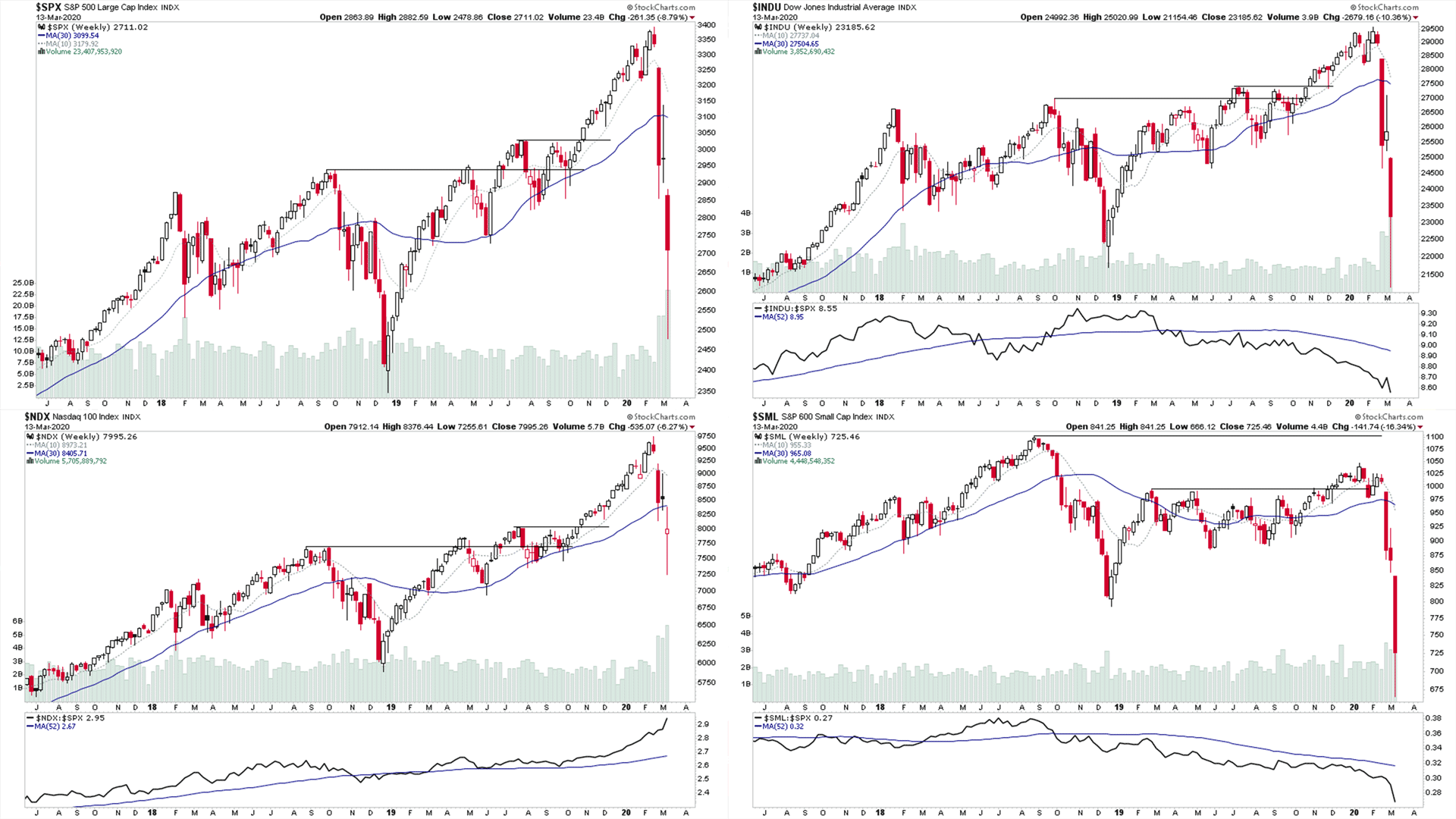
- Major Market Indexes – S&P 500, Dow Jones Industrial Average, Nasdaq 100 & S&P 600 Small Caps (1:04)
- Sector Breadth: Percentage of Stocks Above Their 150 Day Moving Average – Overview Diagram (4:12)
- Sector Breadth: Percentage of Stocks Above Their 150 Day Moving Average – Relative Strength Table (5:28)
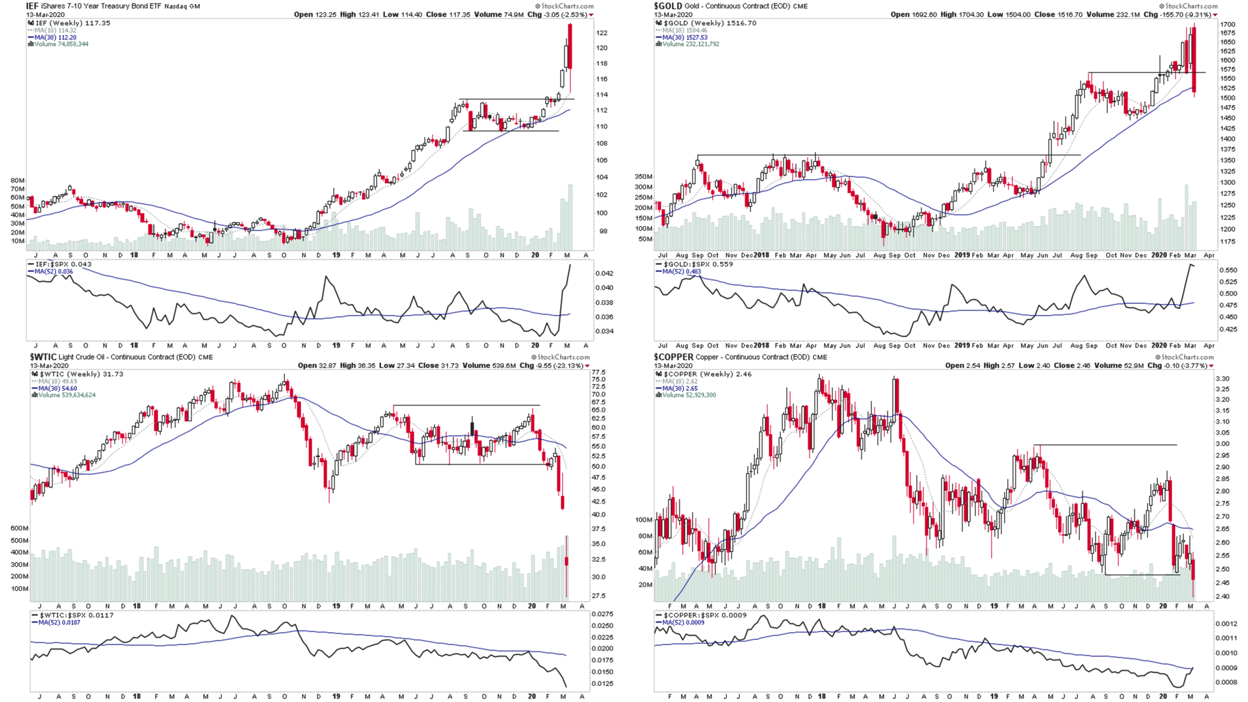
- US Treasuries & Commodities – 7-10 Year US Treasuries, Gold, Crude Oil & Copper (6:55)
- GOLD vs S&P 500 Ratio – 30 Year Chart (10:09)
- US 10 Year Treasuries vs S&P 500 Ratio – 20 Year Chart (11:08)
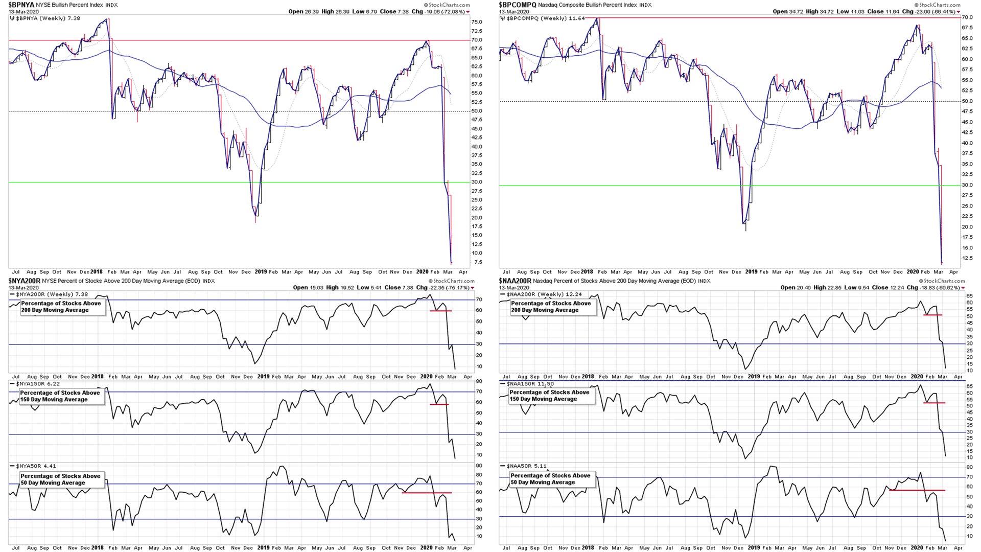
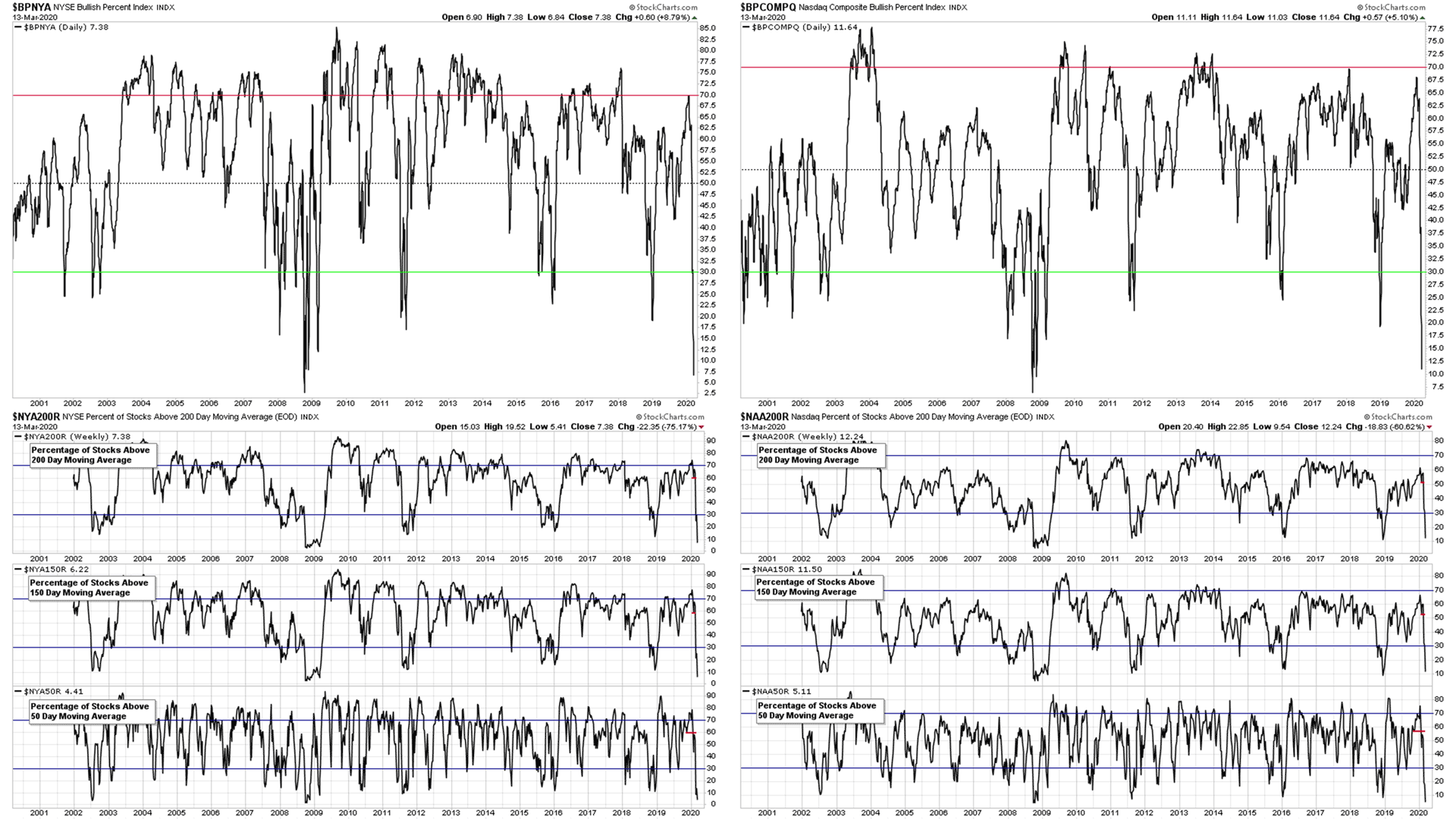
- NYSE Bullish Percent Index & Percentage of Stocks Above Their 200, 150 & 50 Day Moving Averages Charts (12:05)
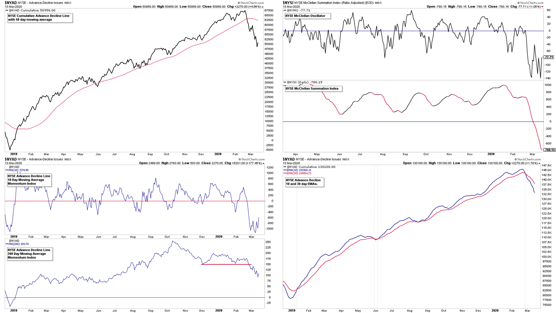
- NYSE Advance Decline Line Charts (15:40)
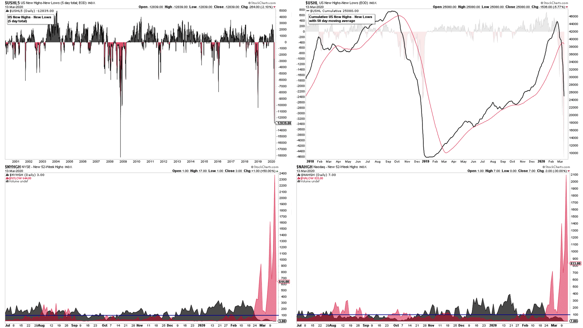
- US New Highs - New Lows Charts & Momentum Index (17:03)
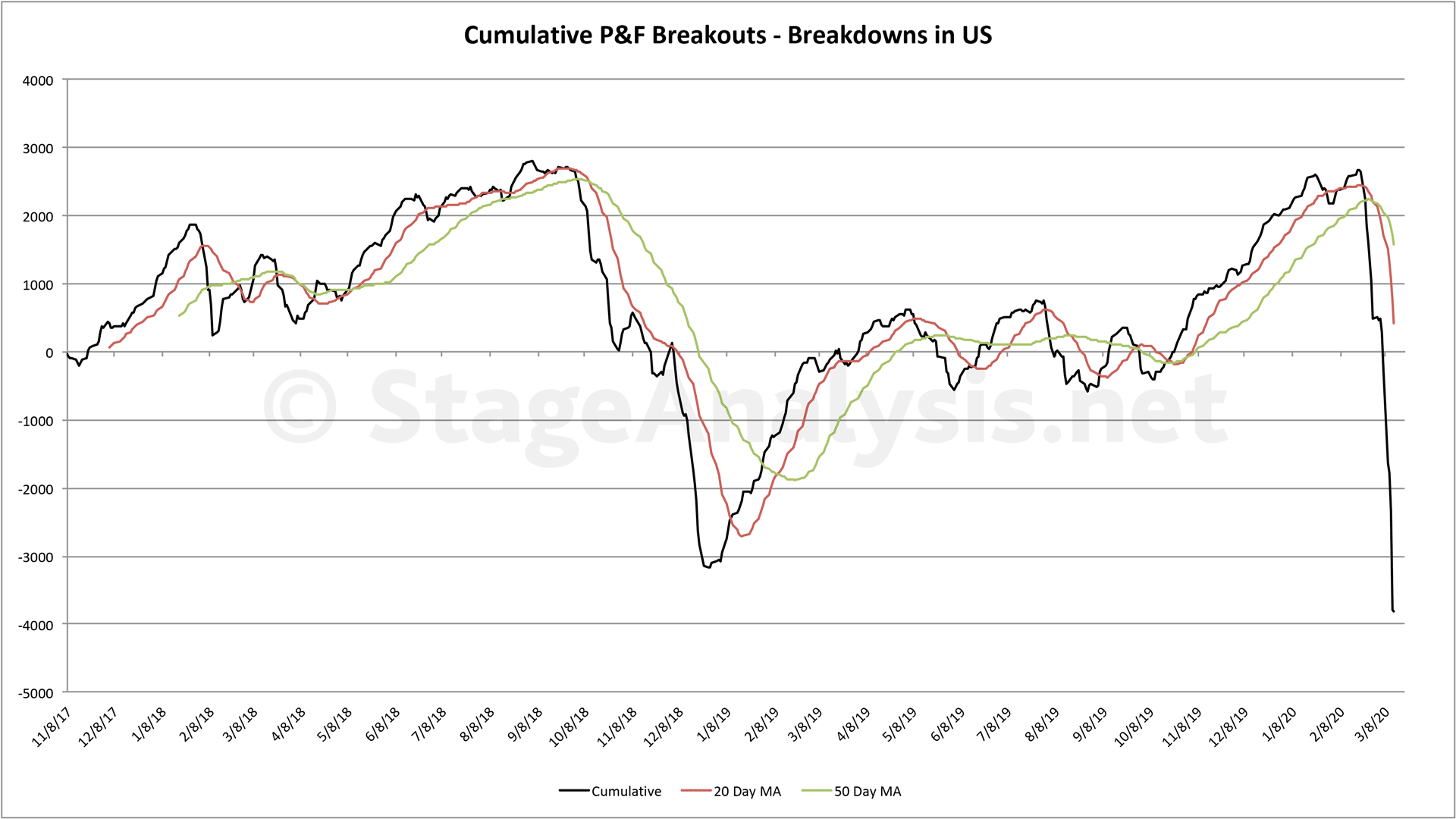
- Cumulative Point & Figure Breakouts - Breakdowns Chart (19:13)
- Overview of the Weight of Evidence (20:33)
The stock market saw another week of heavy selling, taking multiple indexes down to extreme levels, with liquidation type selling across the board, even in previous safe havens such as treasuries and spot gold. Although there was some respite with a strong relief rally on Friday at the end of the day, recovering around 10% in some of the major indexes.
However, we remain in a Stage 4 downtrend (for an explanation of the four Stages – see Stan Weinstein's classic book or visit the forum on stageanalysis.net, which has numerous examples to help learn the method), with only 7% of the stocks in the NYSE and 12% of stocks in the Nasdaq trading above their 200 day moving average, and only around 5% trading above their short term 50 day moving average.
The video also highlights some longer term charts, with 20 year charts of the NYSE Bullish Percent Index & Percentage of Stocks Above Their 200, 150 & 50 Day Moving Averages. Plus the 20 year chart of the US New Highs - New Lows to help give some context to where we are in comparison to other periods.
We may have put in a low, but also we might not have yet. As the extreme levels we are seeing in some of the market breadth charts were only seen around the end months of 2008. Which was a swing low, but not the ultimate low, which didn't come until 3 or 4 months later in March 2009. So although we've gotten to these breadth extremes much faster. We are probably in for a volatile ride for a while yet, with over 90% of stocks in Stage 4, as of this week, even with the bounce on Friday.
Subscribe to the Channel
Subscribe to the Stage Analysis Youtube Channel to get the latest stock trading videos when they are released: https://www.youtube.com/c/StageAnalysis
Follow us on Social Media:
Twitter: https://twitter.com/stageanalysis
Stocktwits: https://stocktwits.com/StageAnalysis
Books to help you learn how to trade stocks*
- Stan Weinstein's Secrets for Profit in Bull and Bear Markets: https://amzn.to/2RpDdPZ
- Trade Like a Stock Market Wizard: How to Achieve Super Performance in Stocks in Any Market: https://amzn.to/2NUXA5p
- How to Make Money in Stocks: A Winning System In Good Times And Bad, Fourth Edition: https://amzn.to/2NYAE5D
- Think & Trade Like a Champion: The Secrets, Rules & Blunt Truths of a Stock Market Wizard: https://amzn.to/37qBSyd
- Momentum Masters: A Roundtable Interview with Super Traders: https://amzn.to/37uzCWs
- Insider Buy Superstocks: https://amzn.to/2RHyVCs
- Point and Figure Charting: The Essential Application for Forecasting and Tracking Market Prices (Wiley Trading): https://amzn.to/2RLPtta
- Come Into My Trading Room: A Complete Guide to Trading (Wiley Trading): https://amzn.to/2tFM1bK
- The New Trading for a Living: Psychology, Discipline, Trading Tools and Systems, Risk Control, Trade Management (Wiley Trading): https://amzn.to/37uAhXW
- Entries and Exits: Visits to Sixteen Trading Rooms: Visits to 16 Trading Rooms (Wiley Trading): https://amzn.to/38JYkCJ
Disclaimer: All stock charts and ideas presented are for educational purposes only. Always do your own research before making any trades.
#stocks #trading #money #nyse #nasdaq #technicalanalysis #stock #stockbreakouts #stocksandshares #investing
*As an Amazon Associate I earn from qualifying purchases.
Disclaimer: For educational purpose only. Not investment advice. Seek professional advice from a financial advisor before making any investing decisions.