
US Industry Groups Bell Curve – Exclusive to Stage Analysis
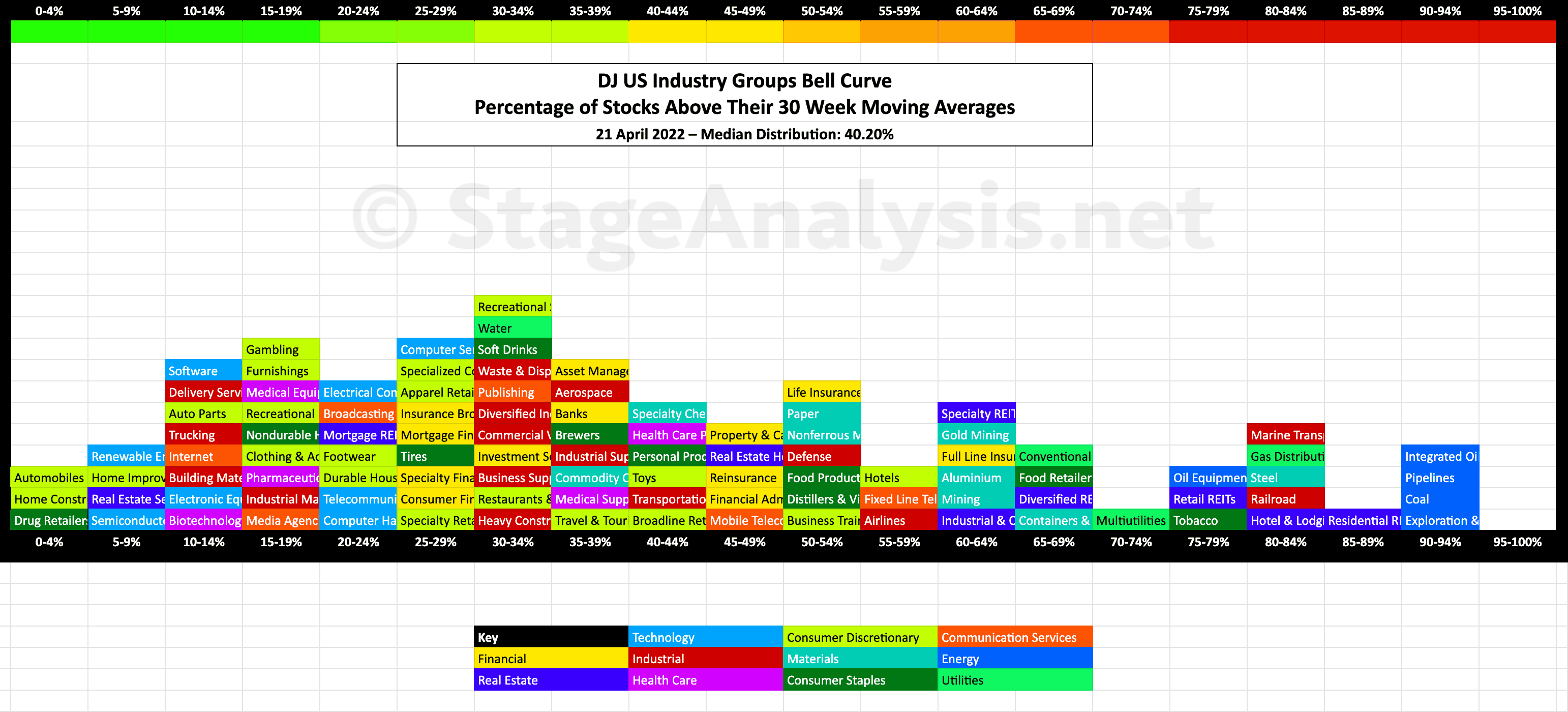
Exclusive graphic of the 104 Dow Jones Industry Groups showing the Percentage of Stocks Above Their 30 Week Moving Average in each group visualised as a Bell Curve chart – inspired by the Sector Bell Curve work by Tom Dorsey in his Point & Figure book...
The current median distribution is at 40.20%.
See the previous US Industry Groups Bell Curve post to compare against.
The full post is available to view by members only. For immediate access:
Disclaimer: For educational purpose only. Not investment advice. Seek professional advice from a financial advisor before making any investing decisions.