
US Industry Groups Bell Curve – Exclusive to Stage Analysis
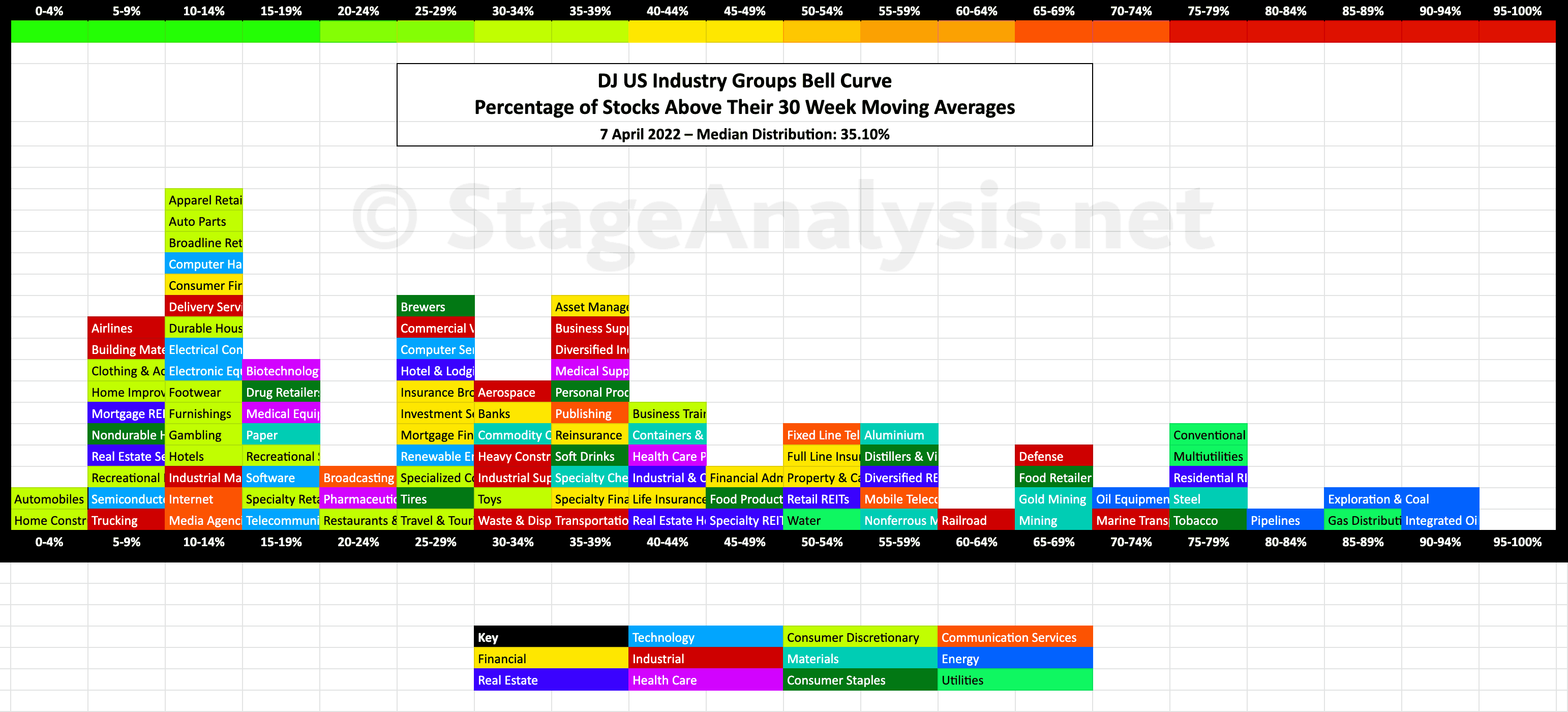
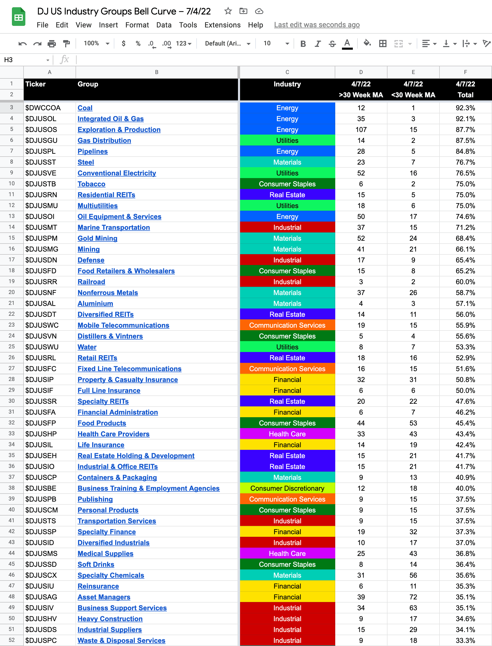
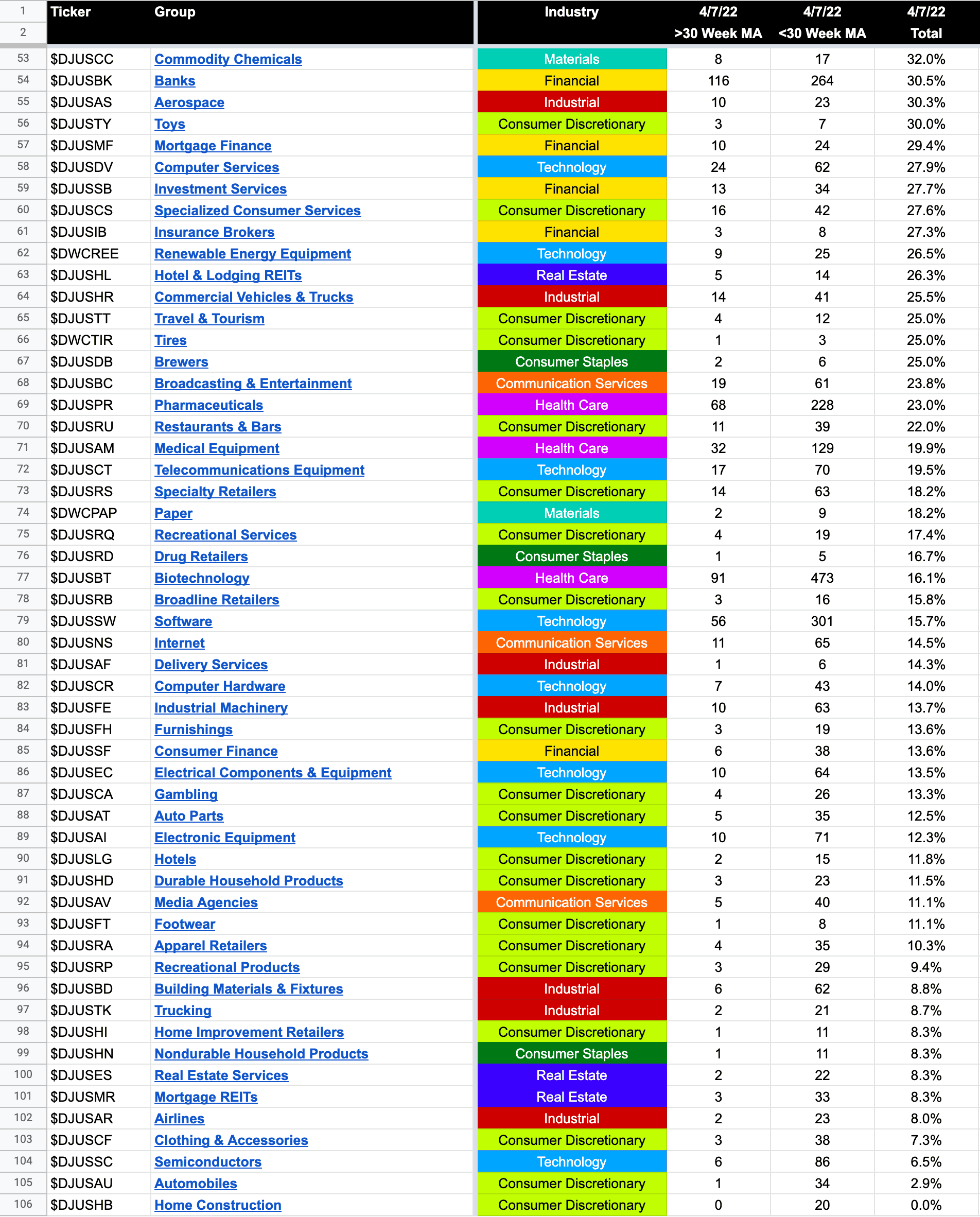
Updated exclusive graphic of the 104 Dow Jones Industry Groups showing the Percentage of Stocks Above Their 30 Week Moving Average in each group visualised as a Bell Curve chart – inspired by the Sector Bell Curve work by Tom Dorsey in his Point & Figure book. Which I'll go through in more detail on the members weekend video.
The current median distribution is at 35.10%.
The graphic gives a unique perspective of the relative strength of each individual group by using the percentage of stocks above their 30 week MA in each group in a similar way that I do with the sector breadth chart that post each month – I've updated the graphic from the previous post on the 22nd March so that you can see the shifts in the groups and the bell curve itself.
The scale is from 0% to 100%, and the chart is laid out horizontally to mimic the appearance of a bell curve – A bell curve is a graph depicting the normal distribution, which has a shape reminiscent of a bell.
I've also coloured coded it so that each sector can also be seen visually at a glance.
104 Industry Groups - Sorted by Percentage of Stocks Above Their 30 week MA
Become a Stage Analysis Member:
To see more like this – US Stocks watchlist posts, detailed videos each weekend, use our unique Stage Analysis tools, such as the US Stocks & ETFs Screener, Charts, Market Breadth, Group Relative Strength and more...
Join Today
Disclaimer: For educational purpose only. Not investment advice. Seek professional advice from a financial advisor before making any investing decisions.