The Stage Analysis members video beginning with a discussion of the latest US Watchlist Stocks in detail on multiple timeframes, Stage 2 Breakout attempts, Stages Summary, the Sector breadth and Sub-industries Bell Curves, Relative Strength Rankings, the key Market Breadth Charts to determine the Weight of Evidence, Bitcoin & Ethereum, the Major US Stock Market Indexes and ETF Summary.
Read More

Blog
“If I could impress on you one fact, it would be that at least 75 percent of the risk in any stock is associated with the market and sector. If the overall market is not supporting higher prices, very few stocks you own, if any, will do well.”
Thomas J. Dorsey – Point and Figure Charting
Being able to identify the four Stages visually on individual stock charts is a crucial skill when using the Stage Analysis method. However, the major stock market index charts, such as the S&P 500, the Dow Jones Industrial Average, and the Nasdaq 100, are all just averages of the stocks within them, and are also distorted by the weighting of stocks.
For example, currently the top 10 stocks in the Nasdaq 100, make up 54% of the weighting. So over half of the Nasdaq 100s price action is determined by just 10% of the stocks. Therefore, you could have a scenario where 90% of stocks in the index are in Stage 4 declines, but the index chart could still look reasonably healthy in Stage 2, as the top 10 stocks are still in Stage 2 advances and holding the index up.
This is where market breadth indicators come into play. As they give you an unbiased look at what’s really going on under the surface of the stock market, and so can help you to determine the actual Stage that the market index is in.
There are many different data sources that you can use to get market breadth information, and each have their own strengths and weaknesses. But in the Stage Analysis method, no market breadth information is used in isolation. Instead, we use what is known as the Weight of Evidence approach, where all of the different market breadth information is combined to determine the overall strategy that should be used, and so can help you to determine whether you should be using a more cautious strategy or a more aggressive one.
Stan Weinstein was famous for using over 50 different indicators to determine the Weight of Evidence. But retail investors shouldn’t be put off, as you can achieve a similar effect by using a much smaller, core set of market breadth indicators, to create your own Weight of Evidence.
19 October, 2025
Stage Analysis Members Video – 19 October 2025 (1hr 7mins)
18 October, 2025
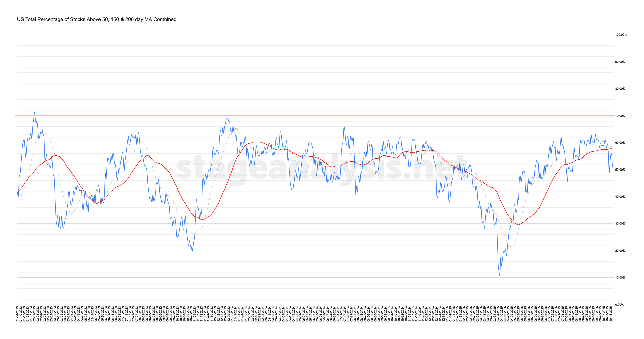
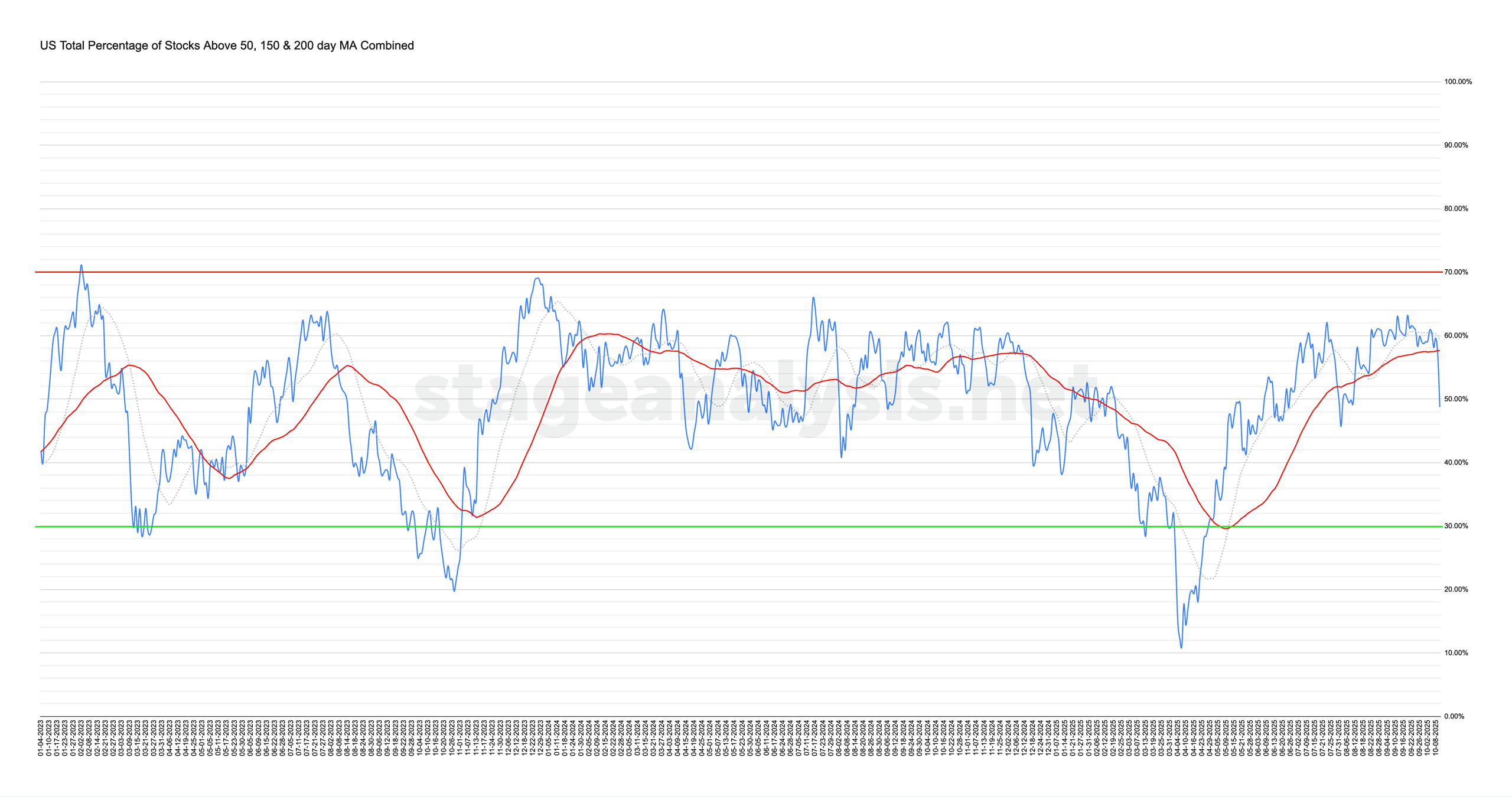
Market Breadth: Percentage of Stocks Above their 50 Day, 150 Day & 200 Day Moving Averages Combined
The US Total Percentage of Stocks above their 50 Day, 150 Day & 200 Day Moving Averages (shown above) increased by +2.59% this week. Therefore, the overall combined average is at 51.35% in the US market (NYSE and Nasdaq markets combined) above their short, medium and long term moving averages.
Read More
17 October, 2025
US Stocks Watchlist – 17 October 2025
There were 14 stocks highlighted from the US stocks watchlist scans today...
Read More
12 October, 2025
Stage Analysis Members Video – 12 October 2025 (59mins)
The Stage Analysis members video discussing the Major US Stock Market Indexes on multiple timeframes, Breakouts and Breakdowns, Stages Summary, the Sector breadth and Sub-industries Bell Curves, Relative Strength Rankings, the key Market Breadth Charts to determine the Weight of Evidence, Bitcoin & Ethereum and ETF Summary.
Read More
11 October, 2025
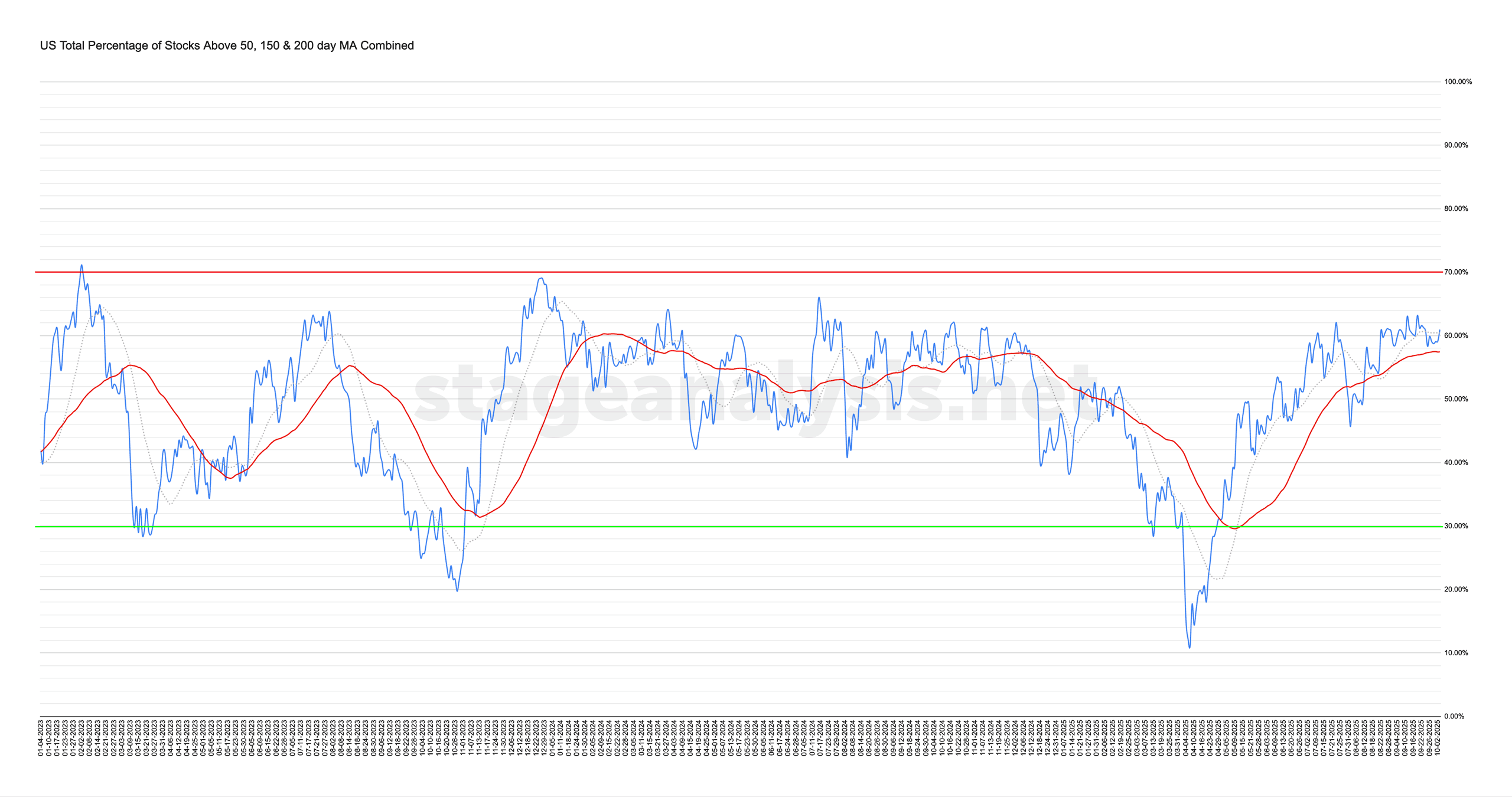
Market Breadth: Percentage of Stocks Above their 50 Day, 150 Day & 200 Day Moving Averages Combined
The US Total Percentage of Stocks above their 50 Day, 150 Day & 200 Day Moving Averages (shown above) decreased by -12.12% this week. Therefore, the overall combined average is at 48.75% in the US market (NYSE and Nasdaq markets combined) above their short, medium and long term moving averages.
Read More
10 October, 2025
US Stocks Watchlist – 10 October 2025
There were 20 stocks highlighted from the US stocks watchlist scans today...
Read More
05 October, 2025
Stage Analysis Members Video – 5 October 2025 (47mins)
The Stage Analysis members video beginning with a discussion of the latest US Watchlist Stocks in detail on multiple timeframes, Stage 2 Breakout attempts, Stages Summary, the Sector breadth and Sub-industries Bell Curves, Relative Strength Rankings, the key Market Breadth Charts to determine the Weight of Evidence, Bitcoin & Ethereum, the Major US Stock Market Indexes and ETF Summary.
Read More
04 October, 2025
Market Breadth: Percentage of Stocks Above their 50 Day, 150 Day & 200 Day Moving Averages Combined
The US Total Percentage of Stocks above their 50 Day, 150 Day & 200 Day Moving Averages (shown above) increased by +0.98% this week. Therefore, the overall combined average is at 60.87% in the US market (NYSE and Nasdaq markets combined) above their short, medium and long term moving averages.
Read More
28 September, 2025
Stage Analysis Members Video – 28 September 2025 (1hr 4mins)
The Stage Analysis members video discussing the latest US Watchlist Stocks in detail on multiple timeframes, then the Stage 2 Breakout attempts, Stages Summary, the Sector breadth and Sub-industries Bell Curves, Relative Strength Rankings, the key Market Breadth Charts to determine the Weight of Evidence, the Major US Stock Market Indexes and ETF Summary.
Read More
27 September, 2025
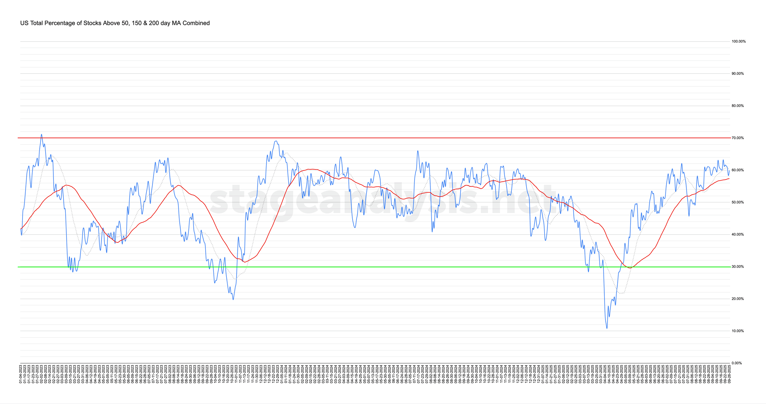
Market Breadth: Percentage of Stocks Above their 50 Day, 150 Day & 200 Day Moving Averages Combined
The US Total Percentage of Stocks above their 50 Day, 150 Day & 200 Day Moving Averages (shown above) decreased by -1.30% this week. Therefore, the overall combined average is at 59.89% in the US market (NYSE and Nasdaq markets combined) above their short, medium and long term moving averages.
Read More