
20 year Nasdaq Composite chart with percentage of stocks above their 200 day MA, 150 day MA and 50 day MA
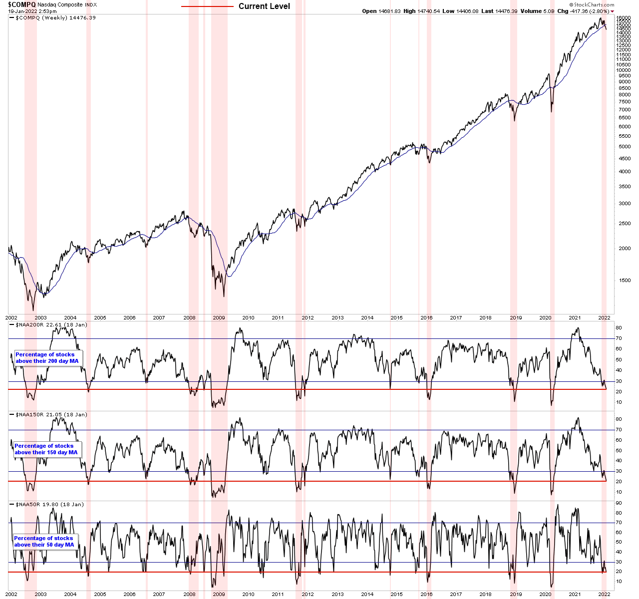
20 year Nasdaq Composite chart with percentage of stocks above their 200 day MA, 150 day MA and 50 day MA underneath for comparison to past periods.
Highlighted areas are when 200 day MA was below 30% level. Red line is current level in each.
Become a Stage Analysis Member:
To see more like this – US Stocks watchlist posts, detailed videos each weekend, use our unique Stage Analysis tools, such as the US Stocks & ETFs Screener, Charts, Market Breadth, Group Relative Strength and more...
Join Today
Disclaimer: For educational purpose only. Not investment advice. Seek professional advice from a financial advisor before making any investing decisions.