
US Industry Groups Bell Curve – Exclusive to StageAnalysis.net
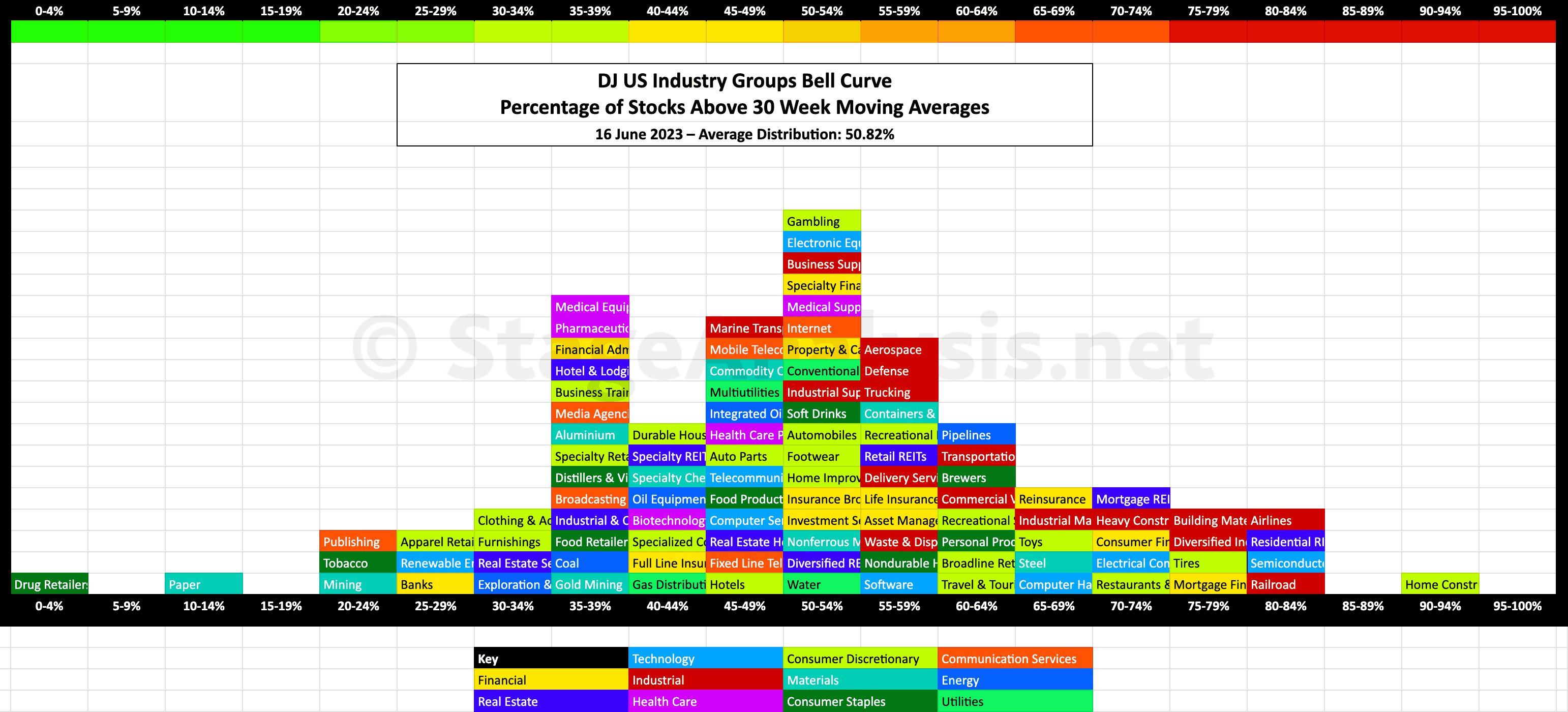
Exclusive graphic of the US Industry Groups showing the Percentage of Stocks Above Their 30 Week Moving Average in each group visualised as a Bell Curve chart.
The current average distribution is at 50.82%, which is a Neutral+ range.
- 26 Groups (25%) in the Stage 4 zone
- 51 Groups (49.04%) in the Stage 1 or Stage 3 zone
- 27 Groups (25.96%) in the Stage 2 zone
The US Industry Groups graphic gives a unique perspective of the relative strength of each individual group by using the percentage of stocks above their 30 week MA in each group in a similar way that I do with the sector breadth chart that post regularly – see the recent Sector Breadth: Percentage of US Stocks Above Their 150 day (30 Week) Moving Averages post to compare.
The scale is the same from 0% to 100%, but the chart is laid out horizontally instead of vertically to mimic the appearance of a bell curve – A bell curve is a graph depicting the normal distribution, which has a shape reminiscent of a bell.
It's coloured coded it so that each sector can also be seen visually at a glance.
I last posted this detailed version of the US Industry Groups Bell Curve back in late March, so you can view that post to see a direct comparison of what has changed over the last three months in more detail.
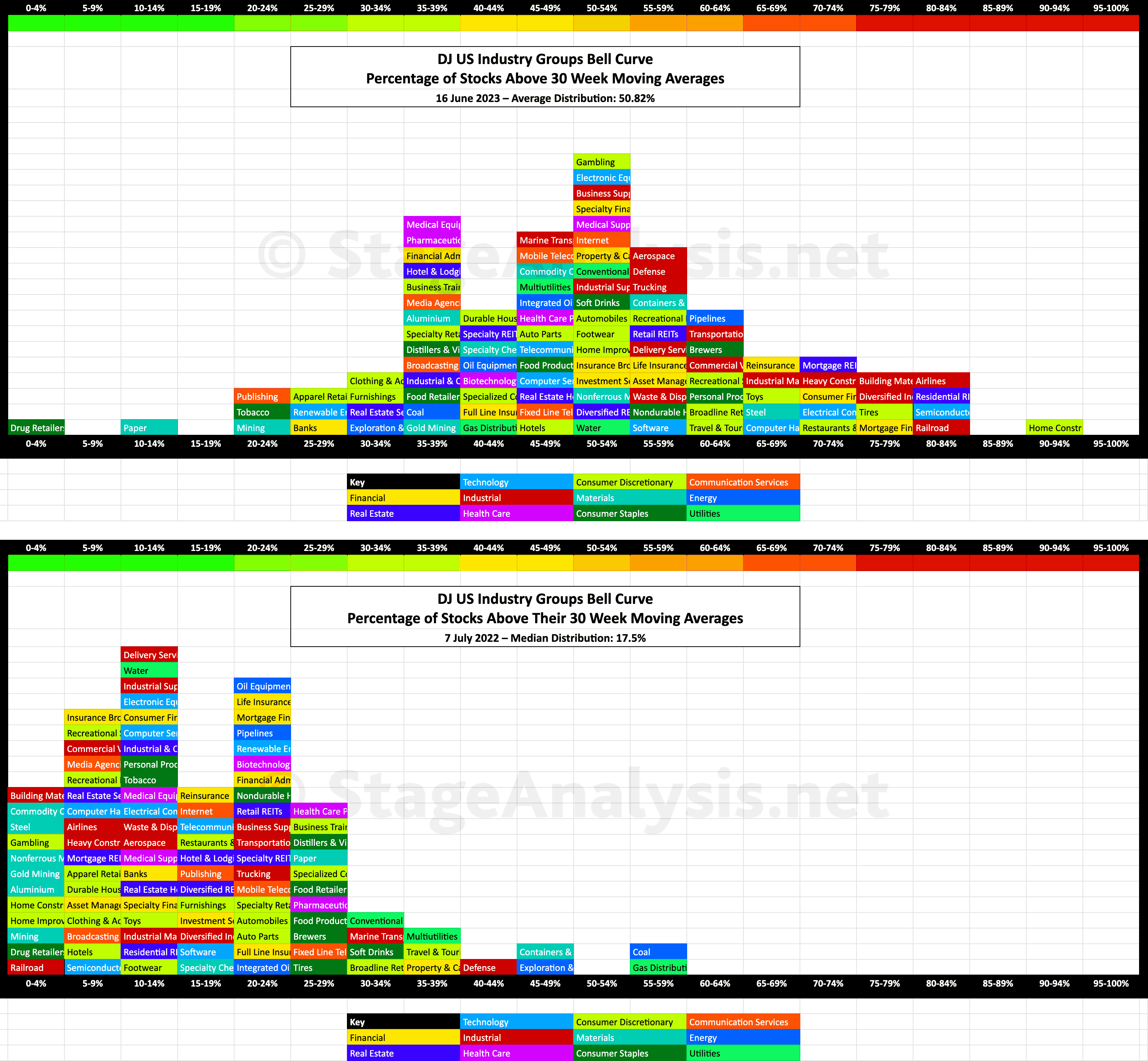
Comparison Versus the 7th July 2022 Chart
It's been almost a year since the June 17th major swing low in the S&P 500, within its Stage 4 decline, that ended up defining the lower range of the Stage 1 base structure. I did do a post around that time, on the 7th July 2022. So it is interesting to compare the changes in overall position and the group changes since then, as it gives some insight in how to use this contrarian breadth measure. As when it reaches extremes like last years diagram shows, the market rubber band is stretched too far in one direction. (i.e. almost all the groups were in the lower half of the bell curve in this case, and the majority where in the lower quarter.) So it was extremely extended on the downside and primed for a reversal.
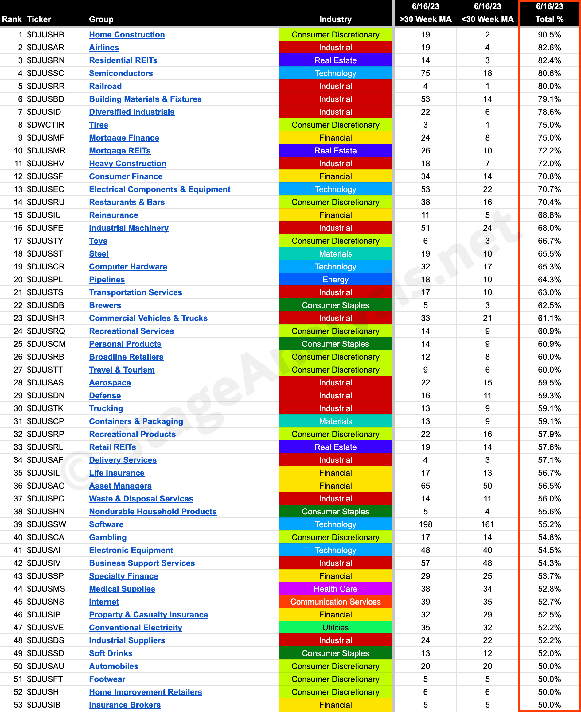
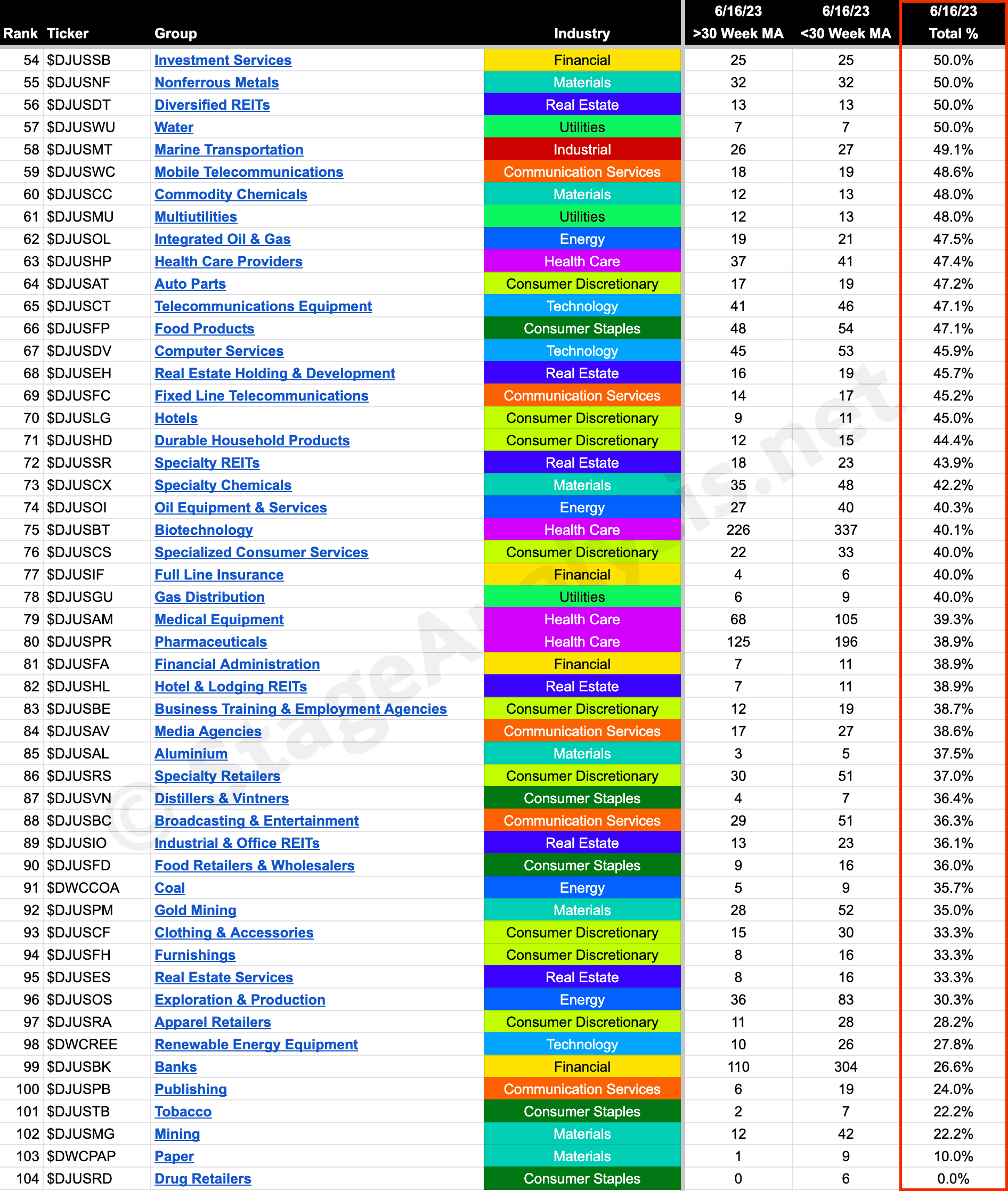
104 Industry Groups – Sorted by Relative Strength
Below is the data tables with the Industry Groups - ordered by Percentage of Stocks Above 30 week MA.
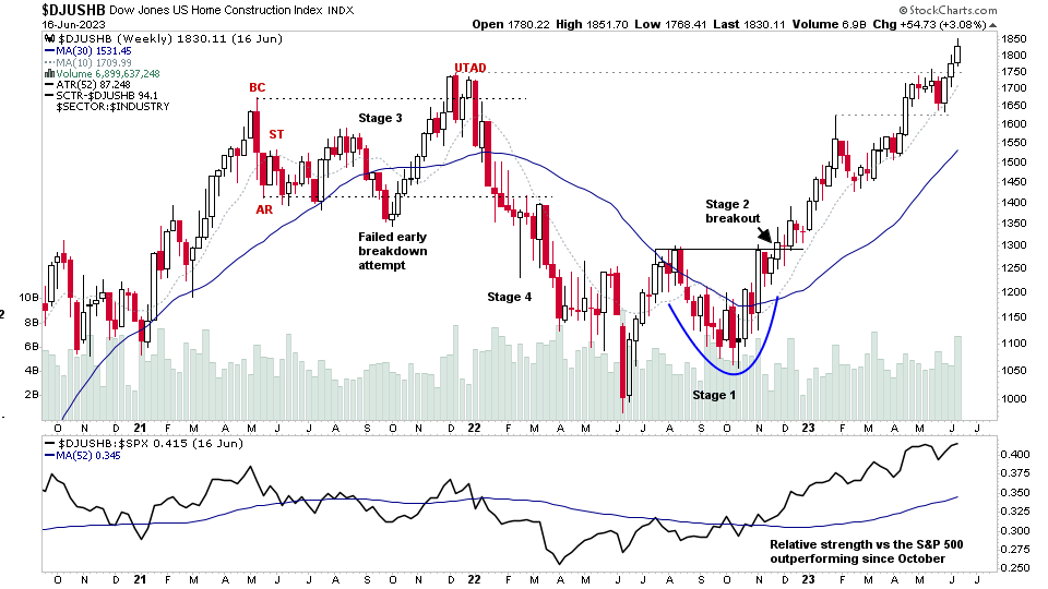
Home Construction continues to lead, as it has done for much of the year, but has come off a little since the last post in March, when it had 100% of its stocks above their 30 week MAs, as that has now dropped back to 90.5%. Which is still extremely strong, but to be expected as the group is now later in its Stage 2 advance, and so a small amount of the stocks have moved into Stage 3.
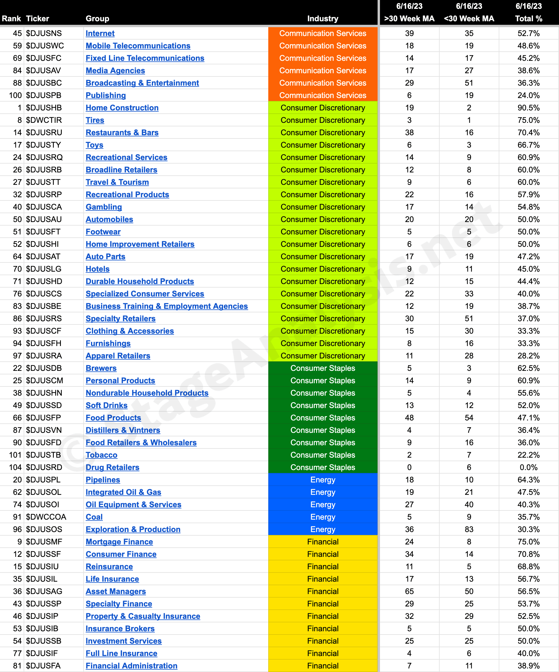
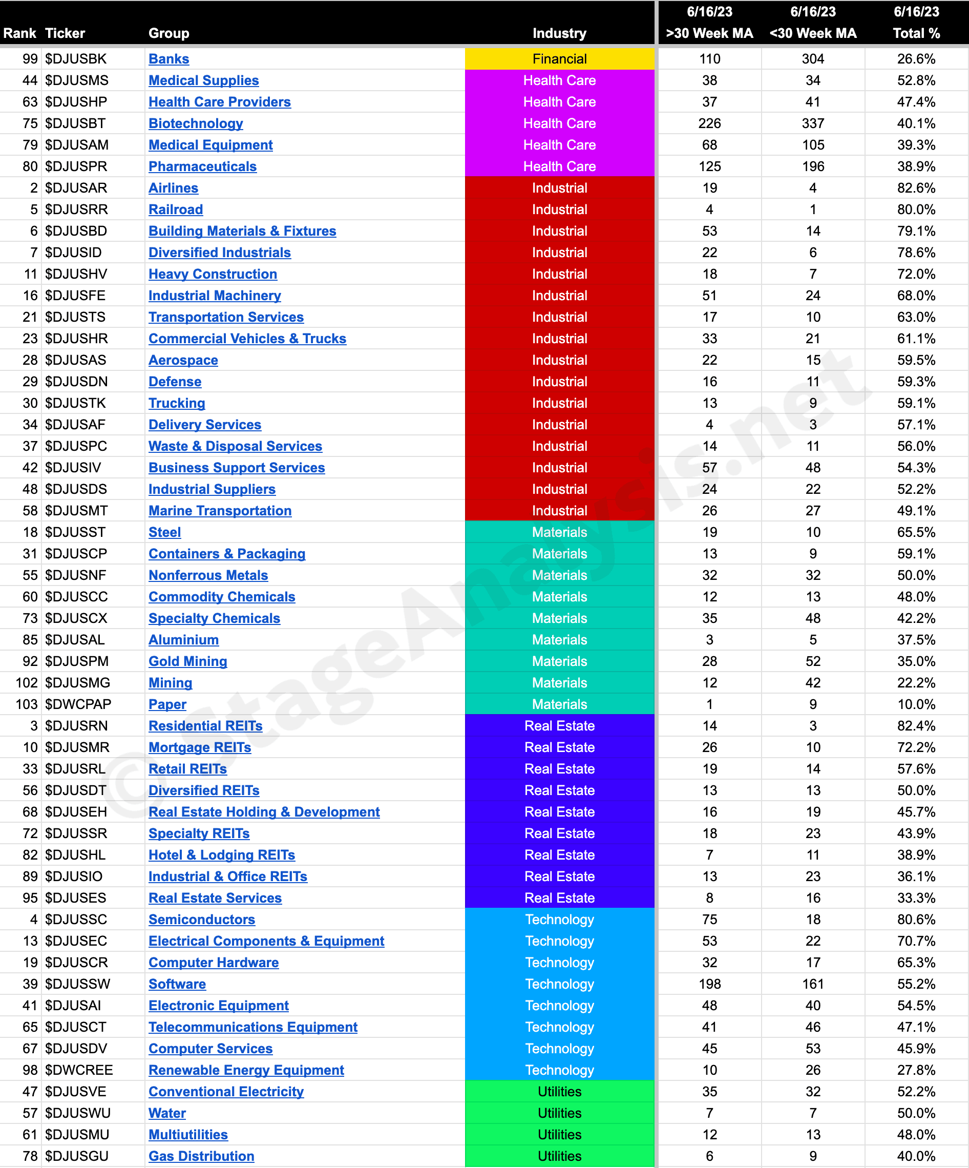
104 Industry Groups – Sorted by Sector
Below is the data tables with the Industry Groups - ordered by Sector and also by the Percentage of Stocks Above 30 week MA in each sector.
Become a Stage Analysis Member:
To see more like this – US Stocks watchlist posts, detailed videos each weekend, use our unique Stage Analysis tools, such as the US Stocks & ETFs Screener, Charts, Market Breadth, Group Relative Strength and more...
Join Today
Disclaimer: For educational purpose only. Not investment advice. Seek professional advice from a financial advisor before making any investing decisions.