
US Industry Groups Bell Curve – Exclusive to StageAnalysis.net
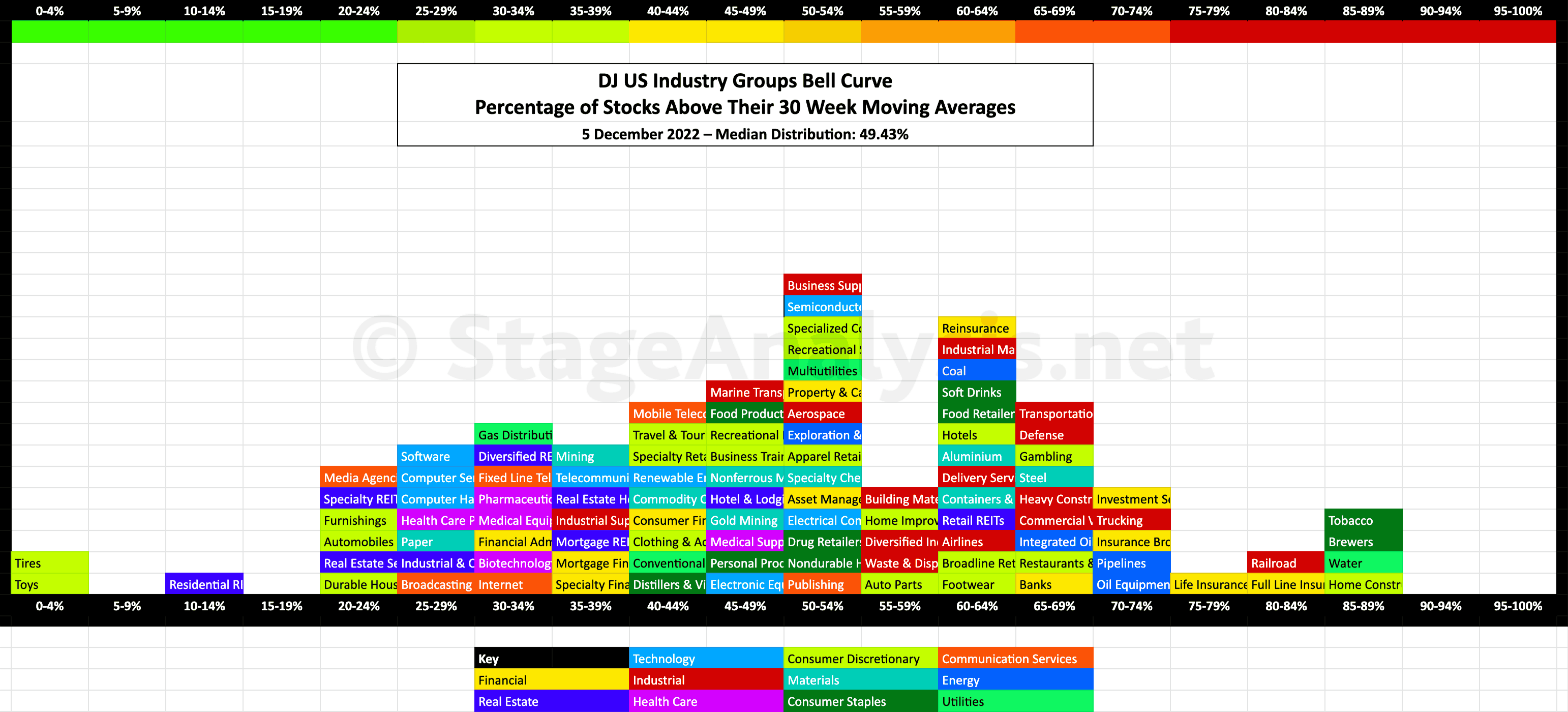
Exclusive graphic of the 104 US Industry Groups showing the Percentage of Stocks Above Their 30 Week Moving Average in each group visualised as a Bell Curve chart.
The current median distribution is at 49.43%, which is the Stage 1 zone.
- 31 Groups (29.8%) in the Stage 4 zone
- 39 Groups (37.5%) in the Stage 1 or Stage 3 zone
- 34 Groups (32.7%) in the Stage 2 zone
The 104 US Industry Groups graphic gives a unique perspective of the relative strength of each individual group by using the percentage of stocks above their 30 week MA in each group in a similar way that I do with the sector breadth chart that post each month – see the recent Sector Breadth: Percentage of US Stocks Above Their 150 day (30 Week) Moving Averages post to compare.
The scale is the same from 0% to 100%, but the chart is laid out horizontally instead of vertically to mimic the appearance of a bell curve – A bell curve is a graph depicting the normal distribution, which has a shape reminiscent of a bell.
It's coloured coded it so that each sector can also be seen visually at a glance.
I last posted the US Industry Groups Bell Curve back in early July, when market conditions where quite different to now, so you can view that post to see a direct comparison of what has changed over the last five months, which has been a major shift back towards the middle of the range with the median distribution currently at 49.43%.
Comparison Versus the Previous Chart
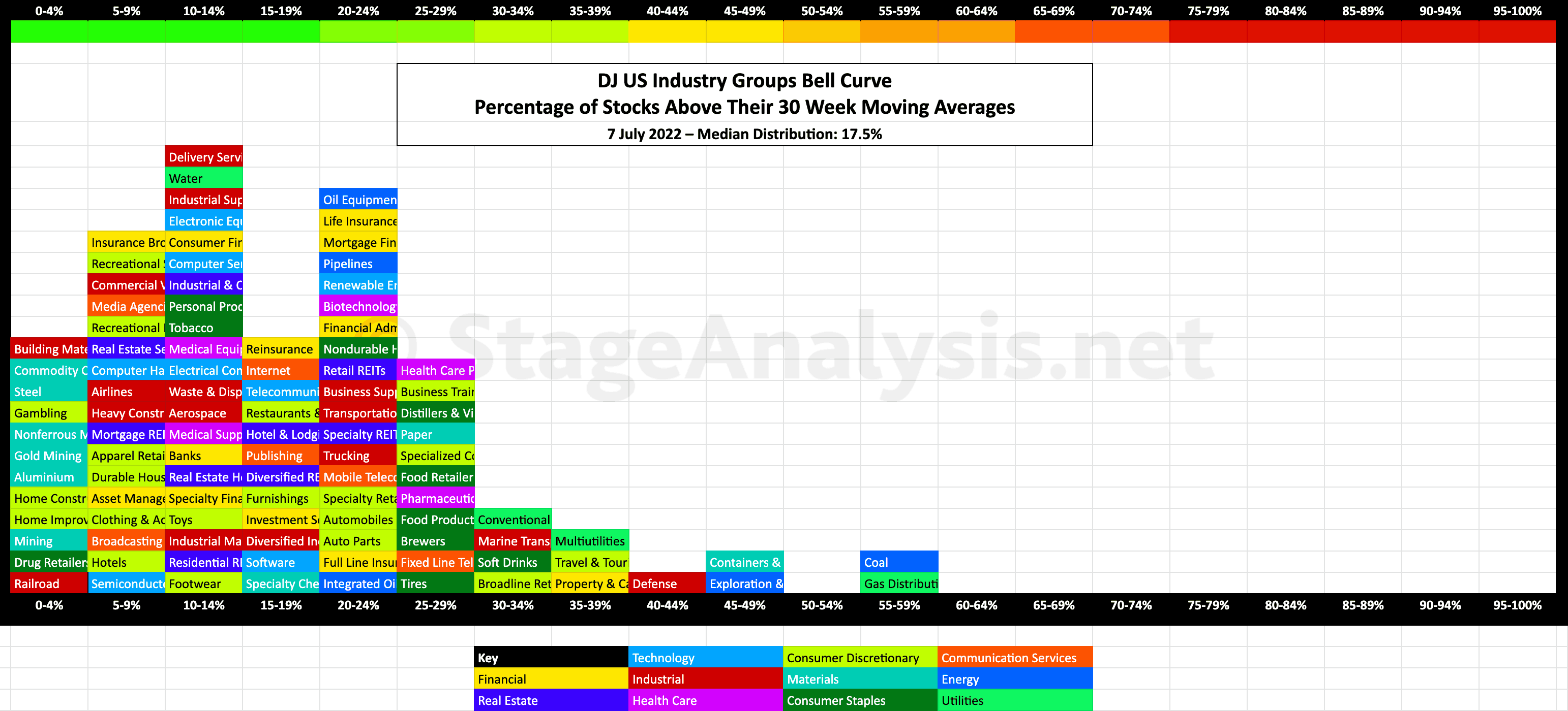
There's been a strong increase in the percentage of stocks above their 30 week moving averages in the vast majority of groups since the previous post in July, with a 31.93% increase in the overall average distribution. So the bell curve has shifted from a deep Stage 4 position back in early July, to a much more neutral Stage 1 position currently almost exactly in the middle of the range.
The below charts show the comparison between the current (December 2022) Stage 1 position and the Stage 4 position from July 2022, and give a good example of the contrarian nature of most market breadth charts. As they are most bullish, when reversing from extreme negative readings like in July at the bottom (left) of range, and most bearish when reversing from extreme bullish readings at the top (right) of the range, and so when they are at extremes of their ranges is when you should be most alert for signs of changes of behaviour in the market.
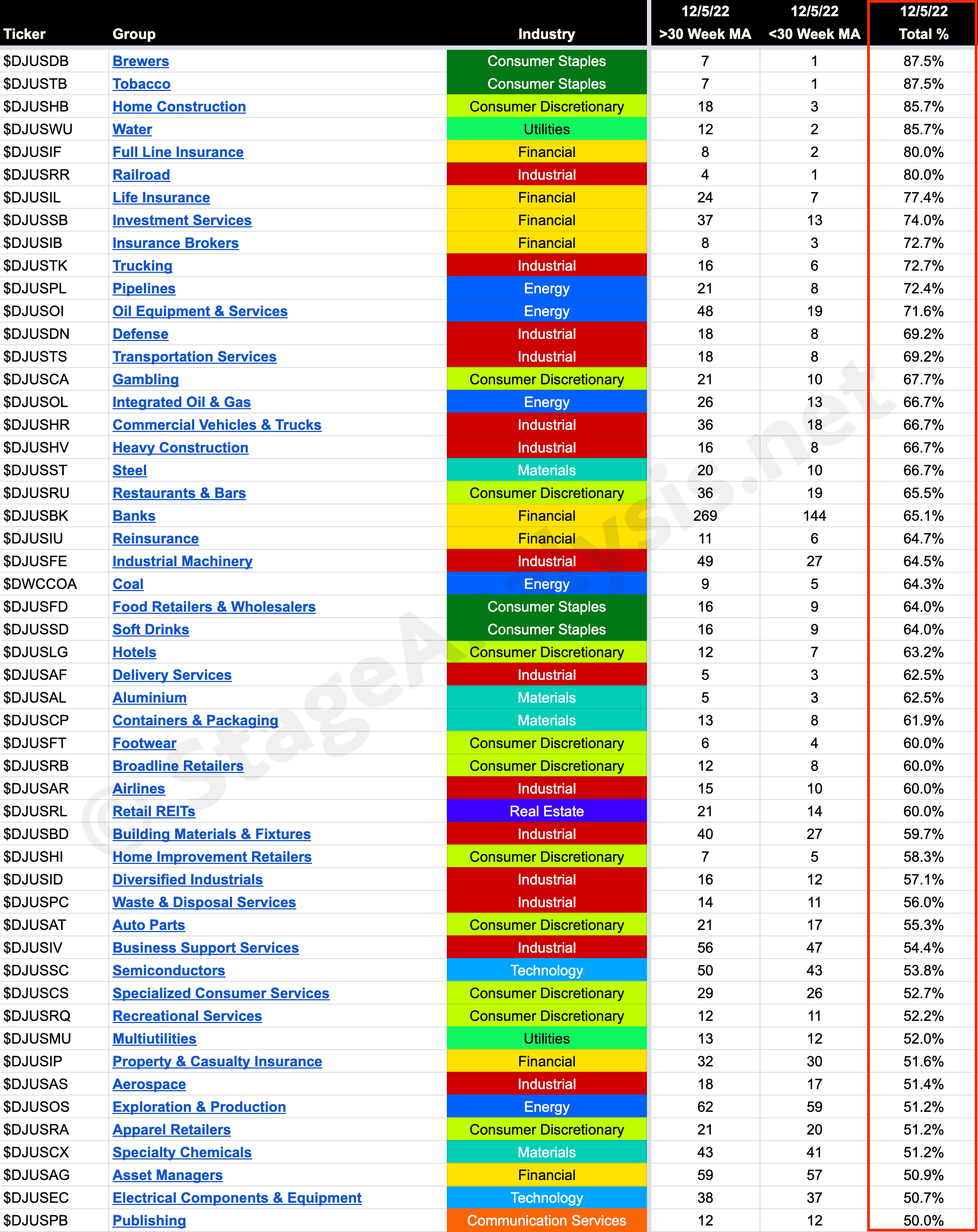
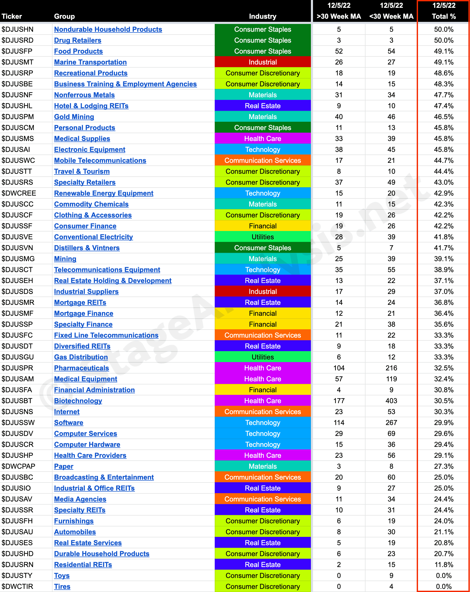
104 Industry Groups – Sorted by Relative Strength
Below is the data tables with all 104 Industry Groups - ordered by Percentage of Stocks Above 30 week MA.
Become a Stage Analysis Member:
To see more like this – US Stocks watchlist posts, detailed videos each weekend, use our unique Stage Analysis tools, such as the US Stocks & ETFs Screener, Charts, Market Breadth, Group Relative Strength and more...
Join Today
Disclaimer: For educational purpose only. Not investment advice. Seek professional advice from a financial advisor before making any investing decisions.